So here, Kevin blowing more minds today with this new phone
http://crackberry.com/exclusive-firs...erry-10-slider
Second BB 10 Phone ever
Printable View
- 12-07-11, 11:26 AMmorpho4444Second BB 10 Phone ever
- 12-07-11, 11:29 AMredk
I actually like the look of this one. I might even go with a full touch screen if it looks like that minus the slider.
- 12-07-11, 11:48 AMBlackberry_boffin
I really cannot argue with this device.
I like my screen real estate and regularly need my keyboard.
In other words I'm glad the torch form factor survives into the next platform. - 12-07-11, 11:53 AMBlackberry_boffin
I am hoping RIM preview these and shed more light at DevCon Asia.
- 12-07-11, 12:02 PMBlacklac
That looks like a solid competitor to me. Good job RIM.
- 12-07-11, 12:33 PMGenTsoChicken
Not in love with it. The tops looks too iPhonish. The keyboard is too similar of the Motorola keyboard, flat on top. No bottoms? The trackpad and the menu bottom was what made the BB distinctive. Still nice that they went on a different direction. I give it a B+.
- 12-07-11, 12:42 PMwayoung
I'm wondering what this keyboard will actually be like. Looking at it vs the screen it looks really small. Can't really tell though since there is nothing to scale it against.
Here's hoping the qnx bold is out before the rumoured nov 2012 date. That's the phone I want. - 12-07-11, 12:51 PMSteve Rizla
Dedicated Call and End buttons are useless, especially if there is a gesture created to bring up the phone app. iPhone users seem to get by just fine without them.
If you touch and hold, then press "Full Menu" (in OS7) there's no need for the old BlackBerry Button. The swipe up gesture can be used to show what's running as well.
Tablet OS apps do just fine with out a dedicated Back button.
The TrackPad is also useless. It's easy to select text on the PlayBook since like 1.0.7.
It's time they got rid of those 5 "buttons" forever. I just see them as 5 extra buttons that could malfunction and force me to return my phone. - 12-07-11, 01:18 PMCosmicHeretic
Make that a 9900 keyboard and release it Q1 2012 and it will be my next phone. Maybe a demo at CES?
- 12-07-11, 01:25 PMwayoungI, and many other playbook users, strongly disagree with that statement. ****, I'm using my playbook to type this and it took four tries to get my cursor in the right spot to delete the rest of your post in the quotation box.
- 12-07-11, 01:45 PMSteve RizlaHmm, that's odd. I have large hands (and fingers) and I have no trouble dragging those blue cursors around to exactly where I want them. Even switching which cursor is the start or end cursor is easier than it used to be. I do remember text selection sucking real bad when it first came out though.
I'm using 1.0.8.6067 right now and it's effortless.:confused: - 12-07-11, 01:52 PMnewcollector
If you reduce the size of the top and bottom bezel on a 9810, then you basically have the Milan screen size. So with the slider out, it should be nicely balanced. Notice the side buttons. Up down vollume with the middle being the convenience key?
- 12-07-11, 01:59 PMForeverupI'm with Rizla on this one I got no problem selecting text on the Playbook.
- 12-07-11, 02:01 PMwayoung
I agree that hightlight words and pbrases is easier (which creates its own problems when trying to open hyperlinks in new tabs) but actually getting the cursor where you want it is still a big issue. Back to my example, i'd touch the screen and my cursor would be before the period instead of after. I'd touch it again - this timw it would be after the "q" - and on and on for a total of four tries before I could delete the text irrelevant to my reply.
If you go into the playbook forums this is a major complaint with a lot of people asking for a virtual trackpad to us. - 12-07-11, 02:34 PMkojita
The phone looks fine, but I expected better in terms of design. The 9900 is soo good next to it. The top as someone said above is way too iphonish like and I dont like the straight keyboard at all, and I think we need a trackpad in addition. I use i tall the time on my 9900.
- 12-07-11, 03:24 PMnewcollectorI think you don't really get how this phone should work. We are talking a phone that will work like the PlayBook, and with a 3.7" screen. No trackpad needed. The keyboard appears to be like the one on the 9810 which performs quite well. The phone looks to actually be about the size of a 9800/9810. And for those of us who are used to a slider, this phone looks great.
How can the top be way too iPhonish? I mean, how many logical ways are there to do a corner? It's probably too early to tell because we only have this one view of the phone. We don't have a side view or an angle view to get a real perspective. - 12-07-11, 03:26 PMSteve RizlaHave you tried dragging the blue cursors? That's what I do.
- 12-07-11, 03:56 PManon(1429304)
Nice to see more news on BB10 phones! Looks decent to me, though I'm not really feeling the bottom corners...would prefer rounded corners all around. My ideal BB10 slider would look like a mini PlayBook, simplistic and classy. Only if RIM can somehow incorporate the optical trackpad alongside the slideout keyboard, now that would be something!
- 12-07-11, 04:17 PMTheScionicMan
Looks good for the first draft that we get to see. This has made me question buying the 9810 that I was just about ready to pull the trigger on. Depends on the price I can get, since there's always more upgrades in the future...
- 12-08-11, 12:03 AMCosmicHeretic
How about a virtual track pad integrated into the bottom of the touchscreen bezel? Seems like a descent compromise.
- 12-08-11, 01:30 AMBB.David
Looks way too top-heavy and looks uncomfortable to type on when the slider is open.
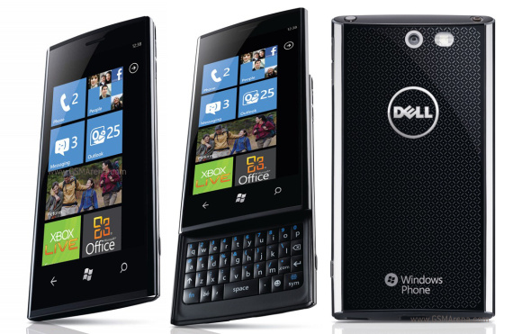
Also, it reminds me more of the Dell Revue rather than the Torch.
- 12-08-11, 02:35 AMmithrazorPretty sure that's the mute button. Like how it is on the new OS7 phones.
LOL. That's so true. I don't get why people are saying it looks too much like the iPhone. - 12-08-11, 06:09 AMBlackberry_boffinWell said. However 3.7" is less than what I was hoping for. Just round it up to 4 already.
This is a handsome beast period, even as a test mule.
The people saying it looks like an iphone have been squinting at their iphones for too long and have gone cross-eyed and are seeing iphones in Samsungs and Blackberrys everywhere.
That keyboard will obviously improve, sheesh! This is RIM people!
I suppose it is wishful thinking to ask for hints on specs at this stage?
If I sat with the designers during the design stage I'd want to know how hard/costly it is to make the Blackberry branded potion touch sensitive to simultate a trackpad. Laptops have been doing this for ages and the technology surely is well developed and cheap enough. We can do with a trackpad surely. - 12-08-11, 12:48 PMnewcollectorIf you want the 4" screen, then I think the London is the one that sports that size. I think a 4" screen on a slider is going to make the phone a little hard to handle when the keyboard is exposed.
The Dell Revue has less screen real estate because of the very wide bezel. I think the Milan looks nicer and more modern. All that wasted screen area on the Revue makes it look clunky, in my opinion. But I do see the similarity. - 12-08-11, 05:17 PMdtango
I dislike the look of this phone. Rim needs to remember who buys their phones. Alienate them and who do they have left?