OS10: If I Wanted WinMo, I'd buy a WinMo
-

- 624
-
- 2,758
-
- 4,660
So you dont want widgets because windows phones have them? Really? How about dont use them if you dont want them.02-13-12 11:48 PMLike 0 -
- 4,456
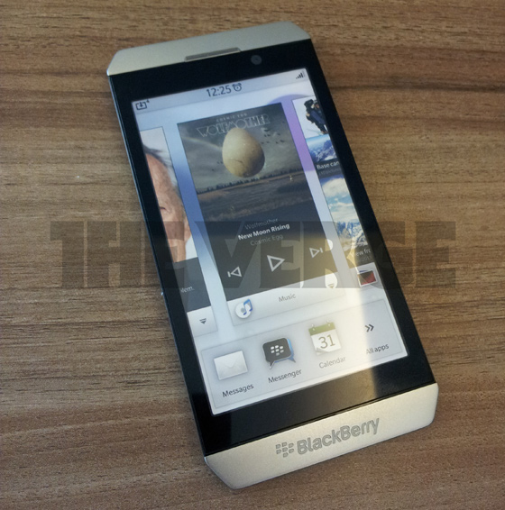
DenverRalphyRetired Network ModI think it's very hard to judge by the photos. And IMHO is nowhere near what the final will look like. I am under the impression it's the QNX/BB10 software loaded onto a current BB device.
I think it's somewhat obvious that the hardware it's displayed upon is definitely not the hardware it will be released on (obviously, that's not new news). Mainly because you see software buttons on the display in addition to the hardware buttons. Granted, I'm not certain why they chose Phone, Search, and Camera (okay I understand Phone and Search... not really certain why Camera would be a software button). The very point there's a Phone software button in addition to the hardware call/end buttons (which are also designed and intended for phone use), leads me to believe that I was correct in the past when believing QNX not being available on current hardware was simply a choice, and not a requirement. But then too... the Phone software button is obviously photo-chopped in on one of the images... So who knows. :shrug:
[edit]Upon looking at the images more, I've come to the conclusion that they are entirely photo-chopped from top to bottom. (status bars change from BB to iPhone, buttons chopped in, etc..) So I figger any opinion is pointless.Last edited by rmjones101; 02-14-12 at 01:21 AM.
02-13-12 11:55 PMLike 4 -
- 464
I am at a loss to see how it looks anything like Windows Phone 7 or the earlier Windows Mobile.app_Developer and mithrazor like this.02-14-12 12:16 AMLike 2 -
- 288
Posted this elsewhere but,
I'm pretty sure the pdf Kevin received was a fake. I've looked at the images pretty closely now and there are a few things I can't get past.
Image 1:
- The solid bar at the bottom. In PlayBook OS this has been translucent so far. It appears you can see the grass through just a little bit at the top of the solid bar, but this isn't remotely similar to whats in play on PlayBook OS 1, or 2. (Yes I know its different but still....)
- If we look at the widgets, each has a name along the bottom with an Icon. The music icon, the maps icon, and the phone icon don't match anything seen in the other images. It would seem strange to me to make a different icon for the same app.
Image 2:
- The information given in the top bar is less than what is currently given on the PlayBook or OS7.x devices. If we're to believe this will be more like the PlayBook I would think the Date would be displayed under the time, and the Alarm Clock neatly beside the time and above the date. The type of network the phone is connected to should be displayed H+, HSPA, EDGE, etc. Also higher resolution icons would make more sense, even just adding in the colour coding from the PlayBook for the Wi-Fi connectivity and Battery Meter would make sense.
- The bottom left corner of the screen looks rather screwed up compared to the first image, this could be due to 'glare' on that side of the phone but it looks wrong. Also the bleed in of the background into the solid bar at the bottom, that might be present in the first image, isn't present whatsoever in the second.
- On the right hand side of the phone, above the top finger, the part of the phone that is receiving glare is suddenly edited out. This seems like a pretty basic mistake for an advertiser to make. I'm not sure why they erased part of the phone.
- Some of the icons look worse than what is currently on the PlayBook, the calculator, BBM, and even the Browser icon doesn't look as good.
- Why is there a phone app if there a dedicated phone button at the bottom? You could argue the same for the current generation of phones, but at least those phones have a physical button vs a software button. Why make two software buttons to bring you to the same place?
- One last thing, why are all the Icons in the Folder present on the main screen as well?
Image 3:
- This doesn't look remotely as good as whats coming to the PlayBook in OS2.0. This is so basic its painful. The Universal Mailbox in this image does not show LinkedIn, Twitter or Facebook integration, which RIM has been shouting about as of late for OS 2.0.
- The two dimensional icons seems like a step back from whats even on OS7.x devices. I know its simple, and sometimes simple is better, but I don't think the acquisition of The Astonishing Tribe was to create two dimensional basic icons.
- Having the Date and the Mailbox title on the same line does not fit with what RIM has done in its Phone OS previously, and not with what they're showing for OS2.0 either.
Image 4:
- Suddenly the information bar at the top is showing us on AT&T's network. It's also completely flipped from whats showing in the other images. Network and Signal strength have changed sides with the battery indicator, and the PM is now the same font size as the time.
- Marina's name and Number appear on a translucent bar, which actually fits to what should be, but deviates from how the home screen appears with a solid bar.
- The red hang up button. Why colour now? Everything else has been painfully white, why put colour here? It doesn't fit. The call button wasn't green.
I can't for one minute consider this to be real. If RIM was going to have someone put together an advert for BlackBerry 10 it would be far more polished than this. It would use the hardware that showed up in the last leak, and not old slides Photoshopped with a new UI. Software screenshots would also be provided and not just pieced together like this. This is a blatant fake...02-14-12 12:25 AMLike 0 -
- 2,809
ummm...yeah.....im with you. This looks nothing like Windows Phone 7....in anyway shape or form lol....and i actually like Windows phone 7
people just need to wait to see how this is gonna work at the end of the month at MWC. This shows nothing in the grand scheme. im sure RIM has a ton of surprises up their sleve.02-14-12 12:26 AMLike 0 -
- 53
I could see it being a hybrid of several ones out there now, customizable to the user's tastes. Since the menu screens are probably coded at a relatively high level, unlike iOS or WinMo, that option is there.
I would argue for a main home screen. Maybe a couple other screens on either side. Each screen is infinitely vertically scrollable.
Option is to have:
- Main with live tiles, side screen with icons
- All screens with icons
- All screen with live tiles
Where folders are interchangeable with icons/live tiles as in current Playbook releases
If developer doesn't include a live tile specific icon / data feed, then use icon. Live tiles taken up more space, but could be more useful for certain heavily used apps.
This hypothetical layout seems to leave everyone here happy?02-14-12 12:31 AMLike 0 -
- 2,733
I don't see what's wrong with WinMo. I have played with the Nokia Lumia 800 a couple of times in stores and simply loved the UI. Intuitive and easy to use. And the killer app is MS Office. That alone makes it a powerful business phone.
If BB10 managed to get MsOffice on their devices all bets are off. I feel RIM should have worked to get MsOffice rather than buy Docs2Go.02-14-12 12:32 AMLike 0 -
- 6,231
Totally agree that the Nokia phones are awesome, with great developer tools and support as well.I don't see what's wrong with WinMo. I have played with the Nokia Lumia 800 a couple of times in stores and simply loved the UI. Intuitive and easy to use. And the killer app is MS Office. That alone makes it a powerful business phone.
If BB10 managed to get MsOffice on their devices all bets are off. I feel RIM should have worked to get MsOffice rather than buy Docs2Go.
MS Office is one of the top competitive advantages for WP7 and Windows 8, as Microsoft tries to become the third platform for phones and tablets.
Why on earth would they subvert that advantage by porting Office to the other OS that is also trying to be the 3rd platform?Last edited by app_Developer; 02-14-12 at 12:40 AM.
02-14-12 12:36 AMLike 0 -
- 2,733
I know they wouldn't. Office is like BBM for RIM. Just meant to say that if RIM had put in the efforts a few years back then maybe MS might have agreed but in the current market everyone would want to keep the slightest edge.Office is one of the top competitive advantages for WP7 and Windows 8, as Microsoft tries to become the third platform for phones and tablets.
Why on earth would they subvert that advantage by porting Office to the other OS that is also trying to be the 3rd platform?
Another reason why I said what I said was that historically MS has been quite platform agnostic and does license their software for other platforms as long as it generates revenue for them. So its quite possible they may still license to RIM. Imagine the sheer number of first day downloads?? It would break some sort of record if App World would show MsOffice available for download. Even if they price it at $30 mark it would be a winner. They reach a targeted and business focussed user base which is starved for a good mobile Office Suite.02-14-12 12:44 AMLike 0 -
- 840
BLAH BLAH BLAH.. This doesn't looks like WM OS at all. QNX blows WM out of the water!Carbonetics likes this.02-14-12 12:46 AMLike 1 -
- 2,733
Is RIM serious?? That looks like a Torch 9860 running the new OS. Hopefully this is a fake.
What happened with this one:

Or this one:
If after all this the come up with a Torch 9860 running QNX, they have seriously wasted their time. They could have brought it out a year back. I still feel the pics are an elaborate hoax, maybe by RIM themselves. I have a very hard time believing that RIM would port QNX on the Torch and tout is a next ten device.02-14-12 01:44 AMLike 0 -
- 1,264
I will not be surprised if Tat was consulted by Microsoft to provide UI inputs for Windows Phone 7. Because here is a video made by Tat 2 years before WP7 was launched and WP7 draws a lot inspiration from the demo mostly the animations, the text layout and the tiles concept etc.
02-14-12 01:57 AMLike 0 -
- 13,516
Superfly_FRRetired ModeratorOP: We're mostly talking about "widgets" here ... and as you know, they stand as you desire ... meaning if you don't ... well, you just don't !
I'm not worried about how deep TAT/Cascade will allow customization: that's just the power of it 02-14-12 02:54 AMLike 0
 -
- 1,242
Calm down everybody! Personally I like the new look.
BUT... It's still more of a concept of what BB10 will look like, and not set in stone. The whole nature of it: released by ad agency, photoshopped render, etc. means that a lot can still change. It's more of an example of which direction RIM is going than a concept set in stone. Think of the screenshots of the different apps for the Playbook right around when it was released. Many of those apps didn't come out for a long time, or still haven't been released. It wasn't meant to be taken literally...02-14-12 04:10 AMLike 0 -
- 14,443
I think those are not widgets, I think BB10 is gonna introduce split screen app use ie true multitasking.02-14-12 05:39 AMLike 0 -
- 1,413
-
- 1,172
I am glad the consensus is a that the images are fake.
I have used BB's since they were monochrome hockey pucks. I love my 9930. But if the new OS looks like that - I probably wont buy a OS 10 phone and continue to just use the OS 7 phones. If I wanted an iOS looking OS - Id buy an iphone.02-14-12 06:14 AMLike 0 -
- 110,431
kbz1960Doesn't MatterI absolutely love the pb UI and would hope that is how they keep it but maybe it will not work for a smaller screen.mjs416 and Superfly_FR like this.02-14-12 06:16 AMLike 2 -
- 4,068
I don't like what I see but I think that these images mean nothing.
I really love Playbook OS and I hope that BB10 keeps that kind of UI.
I hope these pictures mean nothing anyway. It is like a committee just said let's take parts of every mobile os and put them together in a hodgepodge os.kbz1960 likes this.02-14-12 06:24 AMLike 1 -
- 4,660
Maybe you should of read the article first.. They arent showing off the hardware yet because it is not done, this was simply some examples of what the os will look like using the 9860 as a dummy phone.Is RIM serious?? That looks like a Torch 9860 running the new OS. Hopefully this is a fake.
What happened with this one:
Click to view quoted image
Or this one:
Click to view quoted image
If after all this the come up with a Torch 9860 running QNX, they have seriously wasted their time. They could have brought it out a year back. I still feel the pics are an elaborate hoax, maybe by RIM themselves. I have a very hard time believing that RIM would port QNX on the Torch and tout is a next ten device.02-14-12 07:33 AMLike 0 -
- 6,231
But in this mode, most apps would have to render a completely different UI, right? Most apps would be unreadable and unusable at 1/4 size or even at 1/2 size.
So given you have to draw a new UI anyway, I'm not sure how that this functionally any different from widgets or live tiles?02-14-12 07:34 AMLike 0


- Forum
- Popular at CrackBerry
- General BlackBerry News, Discussion & Rumors
OS10: If I Wanted WinMo, I'd buy a WinMo
LINK TO POST COPIED TO CLIPBOARD