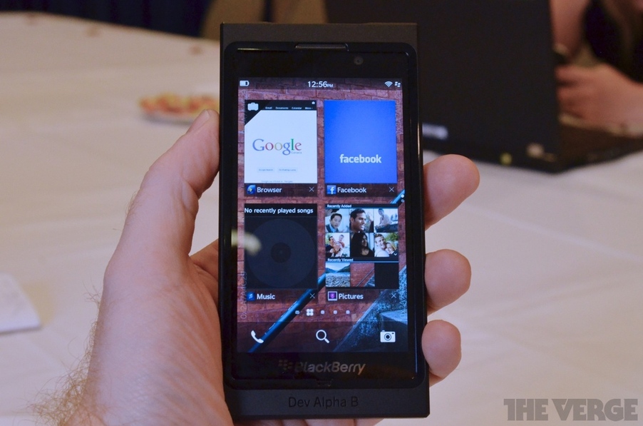
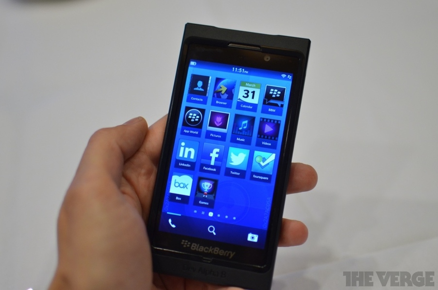
Does anyone know if these are the final icons? They seem pretty plain and boring and I actually prefer the OS7 icons to what we've seen so far of the BB10 icon grid.
Dont think these are the final icons...although if they are, they may not be the greatest look, but also will guarantee they wont be sued by Apple as well
The icons look like they were just slapped together with what existing icon designs they already have on other devices. If they release BB10 looking like it does, I think it will not be welcomed warmly and most likely will get crucified for being bland and unrefined. Take Windows Phone for instance. I think they are getting attention because the design of the OS is inviting and grabs your attention. I'm not saying RIM has to do what WP did necessarily and go flashy, but if they are going to go understated and simple on the OS design, it better ooooz refinement and quality.
It would have been better for RIM if they just used the icon design from the playbook over what has been displayed on BB10 so far and because they didn't, it makes me think they are still working on the final designs. I hope RIM is still playing much of their cards close to the chest. RIM needs to change their image and the way the OS looks is very very important at this stage of the game.
I like the icons, they look crisp and understated. They aren't bold and in your face, they just blend into the UI. It fits quite well with the overall design for BB10.
I don't mind that aspect at all - it sets itself apart.... but the background of the icon text should be transparent to the BB10 background. That would look much nicer.
It was discussed already and bla1ze made it clear they are not final
Link? I hope this is the case as I believe what you were referring to was regarding the previous leaks that were slightly different than what was revealed on Tuesday.
Link? I hope this is the case as I believe what you were referring to was regarding the previous leaks that were slightly different than what was revealed on Tuesday.
I hope these aren't the final icons designs.. They look pretty basic and plain.. Even the way it's set up. Like the flow design when you scroll over to change apps or look at something else.. It looks 1 dimensional and flat...
They must come out with something detailed and fresh! Take advantage of the high quality display!