Demo Available!
http://www.bbin.in/en/wp-content/upl...OAD-POSTER.jpg
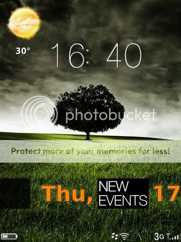
Screenshots:
http://www.bbin.in/en/wp-content/upl...34-225x300.jpg
http://www.bbin.in/en/wp-content/upl...49-225x300.jpg
http://www.bbin.in/en/wp-content/upl...56-225x300.jpg
http://www.bbin.in/en/wp-content/upl...44-225x300.jpg
Video:
YouTube - Crossroad - BlackBerry Torch Theme
Download/Try Crossroad >>
Crossroad - TAT *premium*
Printable View
- 02-16-11, 05:37 PMshahriyarCrossroad - TAT *premium*
- 02-16-11, 05:39 PMphantommadman
Very nice looking theme, clean looking.
Posted from my CrackBerry at wapforums.crackberry.com - 02-16-11, 06:11 PMsleepngbear
Umm, I hate to say it, but this is simply awful. I don't use any social apps, so 1/3 of this interface is useless right off the bat. Supposed to have 8 user customizable icons on the home screen, but there's no hint whatsoever how to assign them. Also doesn't seem to be any way to customize the other 'tabs', which makes them next to useless as well. It keeps the worst of the default OS6 theme and loses most of what was useful. I sure hope this isn't a sign of what's to come on future BB's from TAT.
Posted from my CrackBerry at wapforums.crackberry.com - 02-16-11, 06:17 PMshahriyartry out the demo! the 8 customizable icons are first eight placed in app menu. about other native apps, unfortunately cant be replaced
FYI, TAT - The Astonishing Themes - 02-16-11, 06:37 PMjulioangelortiz
Downloaded the demo. Looks very nice, very fast. Only issue is that it (IMHO) needs a weather slot on the main home screen with the time. And maybe an "Options" icon on the left toolbar.
- 02-16-11, 06:43 PMsleepngbearOh, different TAT. Oops.
I did try the demo, and did a reboot after installing it. I had no icons on the home screen. There was one black block that said 'News Feed' or something like that, and selecting it brought up BBM. Totally weird. This theme would be hugely cool if the 3 tabs could be renamed and the apps in them customizable. But that's my biggest beef with the default theme as well.
Definitely different, I'll give it that.
Posted from my CrackBerry at wapforums.crackberry.com - 02-16-11, 07:23 PMshahriyarglad you like it :)
we actually made an icon free homescreen for wallpapers. anyhow weather can be slotted in one of 8 icons in media. user can switch to media and browse whole phone then lately he'll join up the same homescreen.
about the option, i'll think about it! i use universal search in 'work' instead. options are very deep in OS6 haha - 02-16-11, 07:26 PMshahriyarthat shouldnt happen... its working well on every other's phone. try re-downloading...or applying :s
remind you again; we're different TAT ;) - 02-16-11, 09:46 PMcgmorgan1
This is an awesome theme. Anything additonal to the full version?
Posted from my CrackBerry at wapforums.crackberry.com - 02-16-11, 09:46 PMGdlistns30
The color sceme is not aesthetically pleasing whatsoever! I don't mean that disrespectfully but is it jus the demo version that's setup this way or is the full version the same way?
- 02-17-11, 03:00 AMshahriyarbuttons work :)
- 02-17-11, 03:02 AMshahriyarwhich ones?
- 02-17-11, 03:46 AMLexion
:eek: :eek: :eek: :eek: :eek:
- 02-17-11, 04:09 AMshahriyaryou like it? :)
- 02-17-11, 04:22 AMLexion
Of course I do. It's really cool.
Lovin the "WP7 like" touch. - 02-17-11, 06:14 AMGdlistns30Particularly the menus...BTW what functions are disabled in the demo version?
- 02-17-11, 06:50 AMdayoungdc
Just downloaded and have to say, so far, well done! It is a very original theme with some really interesting features. Will play with it today and provide feedback after I have used it for awhile. Any indication on what you plan to offer in the full version vs the demo?
- 02-17-11, 06:59 AMdayoungdc
Couple rather immediate thoughts. My home screen has two black boxes on it. One right before the day and one right after it, but before the date. The firs one is blank but when you select it, I get the menu that swings out with the phone, sounds and connections icons. The second one says "New Events" on it and brings up the calender. Are they supposed to be there?
Second, is that the defined icons only show up in the "social" menu. Any way to user define where those will live? I would much prefer to have them in the Work menu.
Lastly, is there any chance for a today feature? - 02-17-11, 11:39 AMjulioangelortiz
I'm really enjoying this theme. I used BerryWeather's wallpaper feature to get the weather to appear on the home page. All I need is an Options button on the left slide-out toolbar and I'm good.
- 02-17-11, 01:09 PMshahriyarthanks again. waiting for some more reviews & i'll list out the changes in update :)
- 02-17-11, 01:14 PMshahriyarthe left black box is just a desing not a button. left slider is exactly what you see & will use if you buy full version. we have thought about to put up in 'work' as well but media seem friendly while using. i'll keep in mind about this :)
- 02-17-11, 01:16 PMdayoungdc
Used it for awhile longer. Great theme. Really like the originality. I think it could really benefit from a today feature and would also benefit from cleaner hotspots. Seems like some are able to be activated by the trackpad and some are not. Also would be cool to be able to user define what programs go in each panel although that may not be possible...
Love to get rid of the black squares, it would make the homescreen view off the hook if you didn't have those there.
Looking forward to hearing your plans for any changes!
Thanks - 02-17-11, 01:24 PMshahriyarthanks. 'Today' will be available when RIM launches final Theme Builder ;)
- 02-17-11, 01:43 PMdayoungdc
happy to help with any beta testing you might need. been a fan of your themes...
- 02-17-11, 01:47 PMmolson0
why wait for new TB beta to add today ?