- Forum
- BlackBerry OS Phone Forums
- More for your BBOS Phone!
- BlackBerry Themes
- BlackBerry Storm 9530/9500 Themes
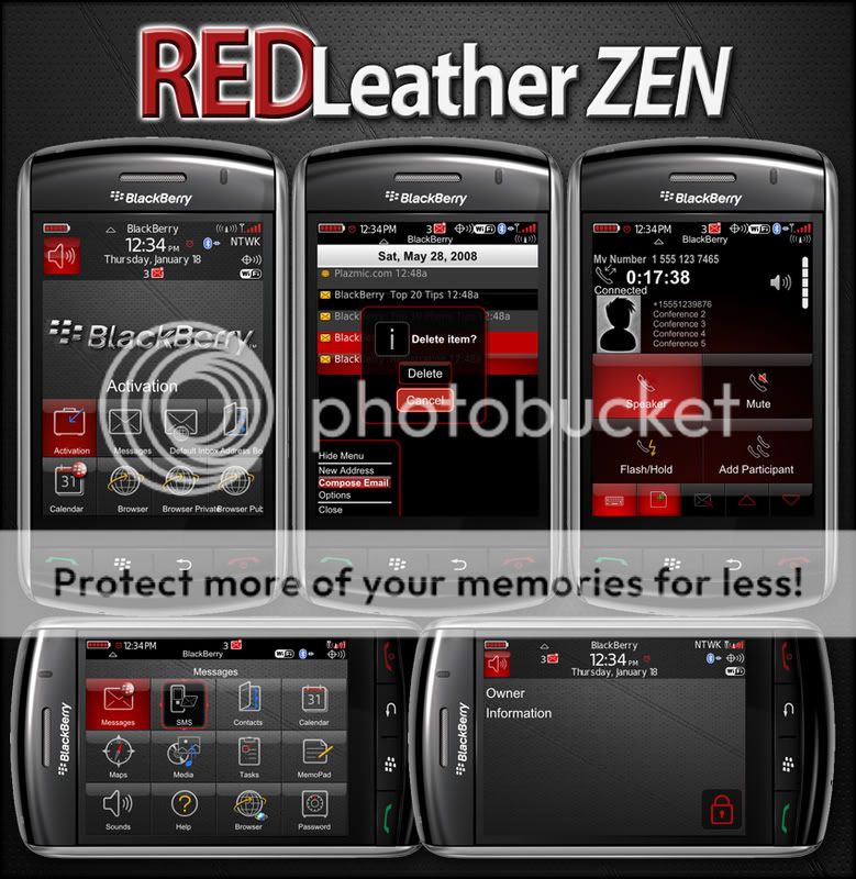
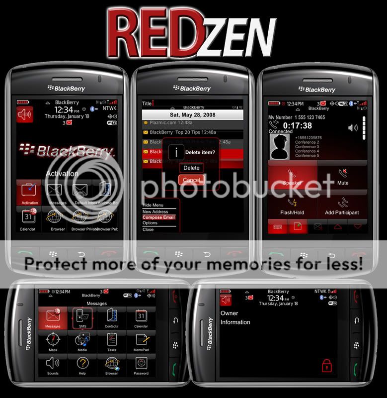
Default Zen with Red them and leather-FREE
-
's Avatar")
- 81
-
- 969
I don't know Smeemm. I fixed it. I don't know why yours is messed up. Try re-downloading it. Delete the theme before you re-download.02-19-09 09:30 PMLike 0 -
- 10
NateMZ... how should this theme look now. I think I am a bit confused as to the backgrounds. Are there 2 now, one leather with the original icons that highlight red and then the black background one with the black icons?
Also, how should the lists look? Mine are black with red highlights.. Let me know, thanks!02-19-09 10:41 PMLike 0 -
- 969
Yeah there are 2 versions. One with leather and one without.NateMZ... how should this theme look now. I think I am a bit confused as to the backgrounds. Are there 2 now, one leather with the original icons that highlight red and then the black background one with the black icons?
Also, how should the lists look? Mine are black with red highlights.. Let me know, thanks!
The lists are black background, lite gray text with red highlight. I am updating the pictures to what they now look like. Sorry if I'm confusing you. This is my first theme.02-19-09 10:46 PMLike 0 -
- 527
I agree with all. Love the theme (black and red are my favorite colors) and you did a slammin
job.
However, I do have a small problem : in the calendar app, the date bar is white with white screen, making it difficult to see.
Thanks in advance and great job!
BTW: it could be a plazmic issue, just wanted to tell you.
Posted from my CrackBerry at wapforums.crackberry.com02-20-09 12:16 AMLike 0 -
- 969
Yes i am aware of the background color problems. Plazmic doesn't allow you to change each app background color. I am going to work on this some more tomorrow and try to find a good balance. I also noticed BBM has some background color issues. It's late so I will resume tweaking tomorrow.I agree with all. Love the theme (black and red are my favorite colors) and you did a slammin
job.
However, I do have a small problem : in the calendar app, the date bar is white with white screen, making it difficult to see.
Thanks in advance and great job!
BTW: it could be a plazmic issue, just wanted to tell you.
Posted from my CrackBerry at wapforums.crackberry.com
Thanks to all for testing. 02-20-09 12:22 AMLike 0
 -
- 50
-
- 98
Do you have a .alx and .cod link?I wanted a theme much like the default Zen but with a red flare to it. So I tweaked the default colors from the theme and came up with these. 2 different versions. one with a dark leather background and one with a black background. After the red version is complete I will make other colors.
**UPDATE** Final beta version is now up. Please let me know of any bugs.
**UPDATE** I have now fixed many of the bugs that I knew about. Please let me know if there is anything else I haven't caught yet.
Red Zen with Leather
Download Red Leather Zen
Red Zen
Download Red Zen OTA
So I can get it on desktop.
Thx.
Real nice and pro theme man.
Keep it up.02-20-09 06:33 AMLike 0 -
- 308
love the way it looks... my only issue with it is in the address book in that there are no between the names so if im glancing at it quickly I get rather confused to what I am looking at.. I assign company names to a lot of my contacts so that I know who they are and what they do. its just hard to tell the difference since there are no separators.
oh and in the bberry messenger, when looking at my different conversations, I cant see who the conversation is with until I highlight one and see the user. If I have like 5 conversations going, i have to highlight them individually to see who it is. The name appears when the highlight turns red... but when it is un-highlighted, it just blends in with the black background.02-20-09 10:18 AMLike 0 -
- 491
Figured out the OTA and it downloaded fine to my Storm I like it!
Last edited by pounder001; 02-20-09 at 12:20 PM.
02-20-09 11:16 AMLike 0 -
- 10
Agreed! This seems to be the only real drawback for me. If you can put a white line in to seperate the names int he address book, that would be a big step. Nonetheless, i really like the theme.love the way it looks... my only issue with it is in the address book in that there are no between the names so if im glancing at it quickly I get rather confused to what I am looking at.. I assign company names to a lot of my contacts so that I know who they are and what they do. its just hard to tell the difference since there are no separators.
oh and in the bberry messenger, when looking at my different conversations, I cant see who the conversation is with until I highlight one and see the user. If I have like 5 conversations going, i have to highlight them individually to see who it is. The name appears when the highlight turns red... but when it is un-highlighted, it just blends in with the black background.
I know we keep barking orders at you like we are in the McDonald's drive thru, and all of this is free to us... just want you to know I appreciate your time and efforts. Nice work....Last edited by smeemm; 02-20-09 at 11:32 AM.
02-20-09 11:28 AMLike 0 -
- 3
I downloaded the Red Leather Zen OTA last night..on my Blackberry and my wifes. We love it thank you... Although, on my Blackberry the SMS messages that I receive or have received show a white screen with only the date showing in black font. My wifes show the black background and white font. So i have tried the following:
deleted the moudules com_plazmic_theme_leather
deleted the themes com_plazmic_theme_leather
did battery pull
Downloaded OTA com_plazmic_theme_leather.jad
no luck it still had the same white background in SMS. Also, I noticed it saved the background and the icons that moved around.
So again I remove it following the same process above two more times and still same issue.
Today I noticed (maybe it ws there last night.**UPDATE** Final beta version is now up. Please let me know of any bugs. So I tried my luck again I did the same steps above and still same issue. I have played around with fonts, background images, default settings etc. Am I missing something? I will play around some more and this time use the JLCMdr to clean it and see it that helps. If there is a post I missed please let me know.. sorry newbie.
Sorry this is long and drawn out...02-20-09 12:31 PMLike 0 -
- 20
I would first like to thank you for taking time out of your day (& night) to put this theme together. To anyone with an Audi this matches the interior perfectly!
Some issues I have found:
-Blackberry Msngr, current conversations still does not show up until highlighted.
-When selecting icons and moving them to a different folder, the sub menu that pops up still highlights in blue.
-The keyboard highlight is still blue.
-I have read that people would like a separator line between contacts in white. I disagree, if anything put a dark gray or medium grey line. I think white would stand out too much and make the design look to “distinct” from the rest of the theme.
-BBM, I would recommend flip flopping the White and Gray as it pertains to the contacts name and availability. The name is in a dark grey and the status is in a light easier to the eye, grey. By switching these two colors picking out contacts from the list quickly would be easier, and the status of that contact would be more subtle.
-Calendar: The current month is still highlighted in Blue as well as the current date. Make similar to the icon highlight red to complete the theme.
-Media Player: Still has blue aura and blue highlight (throughout the media player interface)
Suggestions that would make the theme 110%:
-Skin the icons as follows:
-Media icon has a red note, not blue
-BlackBerry Messenger has a red talk bubble
not blue (the one in back of the white one).
-Calculator buttons red
-Browser Arrow red
That’s all I have for now, hopefully some of these ideas are do-able! Keep up the good work!02-20-09 01:08 PMLike 0 -
- 1,968
I would first like to thank you for taking time out of your day (& night) to put this theme together. To anyone with an Audi this matches the interior perfectly!
Some issues I have found:
-Blackberry Msngr, current conversations still does not show up until highlighted.
-When selecting icons and moving them to a different folder, the sub menu that pops up still highlights in blue.
-The keyboard highlight is still blue.
-I have read that people would like a separator line between contacts in white. I disagree, if anything put a dark gray or medium grey line. I think white would stand out too much and make the design look to �distinct� from the rest of the theme.
-BBM, I would recommend flip flopping the White and Gray as it pertains to the contacts name and availability. The name is in a dark grey and the status is in a light easier to the eye, grey. By switching these two colors picking out contacts from the list quickly would be easier, and the status of that contact would be more subtle.
-Calendar: The current month is still highlighted in Blue as well as the current date. Make similar to the icon highlight red to complete the theme.
-Media Player: Still has blue aura and blue highlight (throughout the media player interface)
Suggestions that would make the theme 110%:
-Skin the icons as follows:
-Media icon has a red note, not blue
-BlackBerry Messenger has a red talk bubble
not blue (the one in back of the white one).
-Calculator buttons red
-Browser Arrow red
That�s all I have for now, hopefully some of these ideas are do-able! Keep up the good work!
To answer your question about icons. Did you happen to read the thread title? Thread: Default Zen with Red them and leather-FREE. Probably why everything is that color.02-20-09 01:19 PMLike 0 -
- 20
Did you even read my post? The icon portion of my post was under suggestions. I am all for the red, I was pointing out issues where things are still blue. Go back to school.02-20-09 01:41 PMLike 0

- Forum
- BlackBerry OS Phone Forums
- More for your BBOS Phone!
- BlackBerry Themes
- BlackBerry Storm 9530/9500 Themes
Default Zen with Red them and leather-FREE
LINK TO POST COPIED TO CLIPBOARD