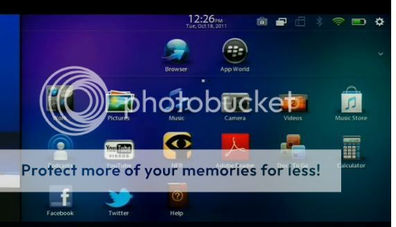
It's true, looks like they got rid of the tabs on the PlayBook home screen and replaced them with those silly white dots to show you what page you're on.
Weren't we asking for renamable/customizable tabs?
Weren't we asking for renamable/customizable tabs?
The PB community has been asking for a lot of things for a long time... hopefully at least some of them will materialize... if a printing function is included that is nice *fingers crossed*
Posted from my CrackBerry at wapforums.crackberry.com
I don't think I like that at all! I have been looking forward to creating my own folders as well.
You can create and name your own folders, but there aren't any tabs.
Even though the tabs are gone it will certainly be easier to organize everything with this new ui.
I really liked the tabs, just wanted to be able to customize them. Wonder how the dock at the top will look when you have multiple apps running in cards too.
I dunno to be honest it looks a lot better to me. There's your most commonly used icons at the top, it just seems a lot more organized. As you can see from that work folder you're probably going to be able to organize apps into folders as well. Makes more sense as a UI overall. I also like that apps now have indicator bars underneath them so presumably when minimized it's easier to tell what apps you're running. Maybe it will even group them together a la the new WebOS?
Yep, full list with folder organization basically mimics what BB users are already used to and it's easier than having a bunch of tabs, one of them being an ALL tab anyways...
The PB community has been asking for a lot of things for a long time... hopefully at least some of them will materialize... if a printing function is included that is nice *fingers crossed*
Posted from my CrackBerry at wapforums.crackberry.com
Another screen during the webcast showed icon called "My Printouts", so you might be in luck
Posted from my CrackBerry at wapforums.crackberry.com
They work on my phone and they work on the PlayBook. If there are still multiple pages of icons as indicated by the little white dots anyway, why not just make them tabs that I can rename?
Yep, full list with folder organization basically mimics what BB users are already used to and it's easier than having a bunch of tabs, one of them being an ALL tab anyways...
What do you mean it's what we're used to? My Torch has tabs. One for each "All, Favorites, Media, etc..."
Little white dots that indicate what page you're on are silly. I don't want to have to remember that dot number 3 has all my media apps. Just have a damn "Media" tab
Isn't that "WORK" icon a custom folder? Looks like a user-created folder that will open up (probably at the top in that top bar) and show the contents of the folder.
What do you mean it's what we're used to? My Torch has tabs. One for each "All, Favorites, Media, etc..."
Little white dots that indicate what page you're on are silly. I don't want to have to remember that dot number 3 has all my media apps. Just have a damn "Media" tab
As I said, one of the larger complaints about OS6 changes was the inability to remove tabs. Also you had redundancy between tabs and folders, since they essentially do the EXACT SAME THING.
As I said, one of the larger complaints about OS6 changes was the inability to remove tabs. Also you had redundancy between tabs and folders, since they essentially do the EXACT SAME THING.
Sorry, still doesn't make sense to me.
You'd rather look through one page with 80 icons for the folder you want than to scroll sideways to the tab category with the icons you want?
I hate scrolling up and down the "All" list for things like my "Media" folder when I can simply swipe left twice and have my whole media tab in front of me.
The tabs work. It's one of the reasons I much prefer the BlackBerry UI to iDroid junk. You know where stuff is and it's easy to get to. There's no guessing which silly white dot has what you're looking for.
When you want to launch an application on your computer, do you go searching through folders to find the executable? No...
Isn't that "WORK" icon a custom folder? Looks like a user-created folder that will open up (probably at the top in that top bar) and show the contents of the folder.
Looks good to me!
It is not a custom folder. As explained in the DevCon Opening General Session today, it is part of a new BBX strategy to allow personal AND corporate content on the same device. APP WORLD will also have a "WORK" section to download work apps into.
My Dad has a BB Curve with OS5 on it. I can't stand navigating through the small screen covered in icons to find the "folder" that I want.
A tab for messaging, a tab for media, a tab for favorites.. it would be so much simpler. Using his curve after using my Torch feels like I'm back in the age of Fred and Wilma.
It's not the same screen size, resolution, or even the same input interface (touch vs trackpad).

")