- Forum
- BlackBerry OS Phone Forums
- More for your BBOS Phone!
- BlackBerry Themes
- BlackBerry Curve 8530/8520 Themes
PREMIUM - [ Euphoria ] - by VinceThePrince - A New Level of Professional
-

- 41
I have a Boost Mobile BB 8330 running on the v438.11 hybrid (base is 5.0.0.438). Not sure about getting a screenshot (any suggestions for app)??? Anyway, I'll try to give a more visual description: place a call to say, your voicemail. When the call connects, quickly look at the left hand side of your screen where it shows the minutes/seconds of your call. The digits do not entirely show. This is on a device that runs on 320x240 resolution.
Hope that helped you...08-09-10 10:55 PMLike 0 -
- 198
Look up "capture it" I think the tech mogul has it for free.
Posted from my CrackBerry at wapforums.crackberry.com08-09-10 11:03 PMLike 0 -
- 68
I would really appreciate if there was the "$" sms/sms shortcut, and a clickable clock, in the pro version.08-09-10 11:20 PMLike 0 -
- 198
-
- 68
Indeed, sms/mms is what I meant. :P
Btw, when I press the media key, the application screen opens, instead of the media folder. Is anyone else facing the same issue? It would be the best if the media key opened the music player, or at least the media folder.
Posted from my CrackBerry at wapforums.crackberry.com08-10-10 07:36 AMLike 0 -
- 148
Almost everything looks good so far for the basic version. However, there is an issue with the Message (either messages or SMS) where the date font is too large for the area. As you can see, the bottom of the text is cut off. This happens no matter how I set the font or display for the Messages. I have also included what my font settings are for this theme.


As to the other main screens, Apps looks good and Home does as well. I do have a question - is the first icon (Profiles on mine) really needed?


I am really looking forward to the full version to see the multiple screens. This is well on it's way to being the near-permanent theme.08-10-10 07:40 AMLike 0 -
- 148
I dont think it is theme related. You only have 2 Convenience Keys (Left and Right) to set. Once in one of the Media applications, you can use the Play, FF and REW buttons to control the playing of the photos, video and audio.
Even on the default theme on my phone (8520 w/ 5.0) it opens the Application Screen.08-10-10 07:45 AMLike 0 -
- 68
Not at all.. The themes I export from themebuilder always come out fine. That is, to say, that the media key opens the media folder. Check out the droplet one, just to confirm.08-10-10 08:58 AMLike 0 -
- 1,454
Since you are using a device/hybrid OS that is not officially supported, there's no way I can pinpoint the error, unfortunately. In OS 5.0, the call screen is meant to look something like this:
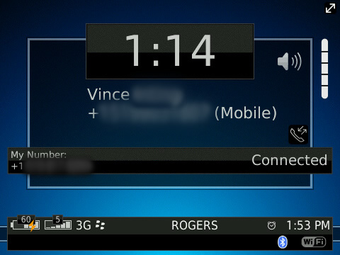
...but your hybrid probably keeps the OS 4.6 behaviour of not letting call screen elements be re-arranged through themes, ending up with that graphical error. This is only my guess, and sorry to say, it's the best I can do, since the call screens look fine on the 8500 devices I've had it tested on.
No worries, there will be QuickLaunch and SMS/MMS shortcuts, just like every theme I make, in the Premium. As for clickable clock, have you tried to do it? I'm pretty sure it's enabled already =P
Thanks for the confirm, Ryan!
Kk, thanks for pointing that out, I'm gonna go ahead and fix that now and push out an update in a few minutes. As for your other question, you don't have to put Profiles there, but just be aware, whatever you put there will show up on the Home Screen. I did it this way because most people prefer to have the CHOICE of what to put there, instead of being forced to put Profiles. This design decision should please the majority of usersAlmost everything looks good so far for the basic version. However, there is an issue with the Message (either messages or SMS) where the date font is too large for the area. As you can see, the bottom of the text is cut off. This happens no matter how I set the font or display for the Messages. I have also included what my font settings are for this theme.
As to the other main screens, Apps looks good and Home does as well. I do have a question - is the first icon (Profiles on mine) really needed? 08-10-10 09:19 AMLike 0
 -
- 1,454
No can do, sir. I've had specific request to be able to show as many Indicators as possible, and if I put those there, there would only be room for 2, or 3 at the most, and that's a big no-no for convenience sake. If anything, I can have Bluetooth in one corner and WiFi in the other corner, that way they're not together?08-10-10 09:34 AMLike 0 -
- 148
Under the large clock then? or are there other things that pop up at that location? They just seem lost up in the corner, like an afterthought? Also, it may be different on the full version as well. But for the Basic version, I think it would be cleaner if those were incorporated into the graphics somewhere.
I am looking at it strictly for aesthetic reasons - I don't use WiFi at all, and rarely bluetooth.08-10-10 09:52 AMLike 0 -
- 1,454
WiFi/BT are non-editable elements via code, so I must make sure they are in a position that will always be non-obstructive, regardless of what's going on with the rest of the screen. I cannot manipulate these elements to slide/hide/show as RIM has meant these to be static. The only other spot would be the bottom taskbar but like I said, we want as much room for indicators as possible.Under the large clock then? or are there other things that pop up at that location? They just seem lost up in the corner, like an afterthought? Also, it may be different on the full version as well. But for the Basic version, I think it would be cleaner if those were incorporated into the graphics somewhere.
I am looking at it strictly for aesthetic reasons - I don't use WiFi at all, and rarely bluetooth.08-10-10 10:22 AMLike 0 -
- 1,454
-
- 68
-
- 1,454
-
- 148
It probably depends on how the theme was coded and what builder was used. I am not a theme maker myself, so I cant really answer this.
I have tried this on 5 different themes, and the only one that I found that brought up the Media folder was the AT&T theme that was on my phone by default.08-10-10 12:49 PMLike 0 -
- 198
In the first image it looks like there are a few icons at the bottom of the screen but they're not in the free version...have those bee scrapped completely or will they be in the premium version?
Posted from my CrackBerry at wapforums.crackberry.com08-13-10 10:24 AMLike 0 -
- 68
Those are probably notification icons. I, for one, likes the layout in the first image better. Only notification are in the bottom bar, and no battery/signal meter. And I agree with someone who posted earlier, that the wifi and BT icons look quite out-of-place, in the top left corner. There has been a dearth of news, over the last couple of days.. What's up, Vince?08-13-10 11:55 AMLike 0 -
- 65
great theme. one thing i noticed there is no option to explore media card when you go to the Media folder.08-13-10 03:14 PMLike 0


- Forum
- BlackBerry OS Phone Forums
- More for your BBOS Phone!
- BlackBerry Themes
- BlackBerry Curve 8530/8520 Themes
PREMIUM - [ Euphoria ] - by VinceThePrince - A New Level of Professional
LINK TO POST COPIED TO CLIPBOARD