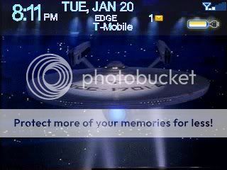
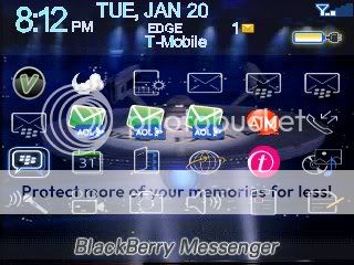
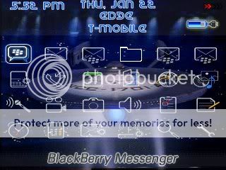
Hi all, I've been experimenting with making a theme for myself and I wanted some advice. The screenshots below are from one I created (except the incoming call, that's a screencap from theme builder) but it lacks...originality or at the very least some excitement. Does anyone have suggestions on how to spice this up? Better icons (or where to get them, better graphics or a different layout? I ask because I've seen some amazing themes on here and my version seems bland.
Theme advice?
Printable View
- 01-20-09, 11:00 PMGrimaginationTheme advice?
- 01-21-09, 10:48 AMganns1980
Couple of suggestions. On the fonts, there's a little italic A next to where you pick your font. Use that - it smooths out your fonts. Try some different battery and signal meters. When I first started, I took the default Plazmic ones and edited them. That gives you a good idea of what's needed in meters. If you need a free image editing program, try out GIMP. Also, go to 1001 Free Fonts - Download Free Fonts - Free Windows and Mac Fonts and look for some star trek-ish fonts.
Good luck, and just keep working at it! - 01-21-09, 12:35 PMDaniel.Black
Excellent suggestions from Ganns. I would add that you might want to try different, or at least consistent, set of application icons. I like the backgrounds you chose, now you just need to spruce it up a bit. On the issue of fonts, try to be consistent with the color and style. The banner needs to be readable, so sometimes the base font doesn't work here, but the color can be the same. Good Luck!
- 01-22-09, 12:33 AMGrimagination
This is why Crackberry rocks! Thanks to you both for your help, I really appreciate it. Gimp, btw is awesome! I've been without a graphic editor since I upgraded to Vista. (It doesn't support my version of Adobe.) Thanks for recommending it. I'm taking the advice you both gave and slowly building my own theme, which may not be good but it will be mine :)
The only thing holding me back now is that I can't change the white background to a picture in the 'active call' portion of Plazmic and I can't change the program icons of aol mail. Other than that I'm fairly pleased.
Thanks again. - 01-22-09, 01:50 AMhutasuhut
Can you share with us the Enterprise NCC 1701-A wallpaper and Federation's logo. Thanks..
- 01-22-09, 09:32 AMganns1980
No problem! Yes, GIMP is awesome, I've been using it for years. As far as the active call screen and the AOL icons, there's nothing you can do about those. The AOL ones can be seen as s 3rd party app, they choose their own icons. The customized active call screen is only available for OS's 4.6 and above. Bummer, I know!
Keep working at it and let us know if there's anything else you need! - 01-22-09, 08:12 PMGrimagination
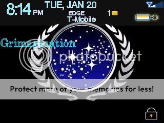
It's not great, but I'm themed! I'll probably change the backgrounds to something a little more adult but still being kind of new to blackberry I feel like a kid with a new toy. I can use this as a template and with the tips on GIMP and the fonts, I can really abuse my berry's memory! Thanks again for all of the help.

- 01-22-09, 08:19 PMGrimagination
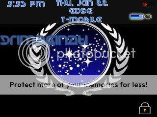
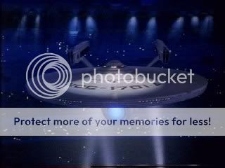
M.R.L., here you go. Both are 320x240. Enjoy!

- 01-23-09, 12:58 AMganns1980
Looking much better! Couple of other tips - on the font, where you choose the colors, I see that you have blue as the main color and white as the outside. For the font on the banner/screens, you can make that outer color go away. When you open the color dialog, there's a tiny box with a red line going through it. I don't know if you knew about that or not. :)
Another thing is the icons. Did you use the ones right out of the Plazmic folder? Here's a couple of posts to help out with resizing icons. here and here. Keep at it - you're on the right track!
BTW, I like how you used blue - tied it all together nicely. - 01-23-09, 04:52 AMhutasuhut
[QUOTE=Grimagination;1477277]M.R.L., here you go. Both are 320x240. Enjoy!
Thanks a lot buddy, appreciate it :) - 01-24-09, 12:57 PMGrimagination
Ganns, I didn't know that about the text - Thanks! I'm going to keep the outer color but in seeing the dialog options, I found the alpha adjustment.
I'm kind of at am impasse with the theme. GIMP doesn't allow for multiple resizes for icon size pictures and every set of bold icons (for the curve) that I've found have icons missing. - 01-24-09, 02:25 PMGrimagination
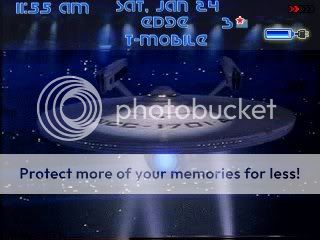
Ok, I think I'm done! Ganns, thanks for all of your help. I should also thank StevenInSL for providing me with the bold icons for the curve. The icons are spaced a little better and definitely cleaner. This turned out to be a lot of work, and I couldn't have done it without help.
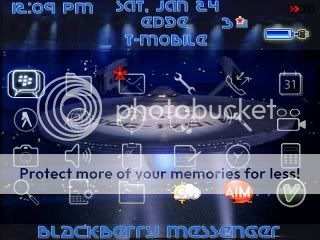
- 01-24-09, 06:30 PMganns1980
Looks great! I like how you kept just a bit of the white, and the icons look much better!