- Forum
- BlackBerry OS Phone Forums
- More for your BBOS Phone!
- BlackBerry Themes
- BlackBerry Bold 9700 Themes
*Free* Pure
-

- 16
Hey everyone.
because the Crackberry and Themelab community helped me out so much with building this first theme of mine.
I figured I'd throw it up here for anybody who likes it.
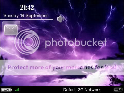
I designed this theme to have a minimalistic look,
but at the same time have the functionality from the 12 icons, weatherslot and hotkeys.
Features:
* OS6 icons w/ focus
* hidable WeatherSlot: slot 1 of the app-screen
* Hidden Dock with 12 scrolling customisable icons: slot 2 - 13 of the app-screen
* hotkeys:"w" hides weatherslot
"s" shows weatherslot
"$" launches SMS/MMS
"0" launches Profiles
"f" launches Facebook
"spacebar" launches QuickLaunch (not tested since I don't have the app myself)
"+" launches calculator
"m" launches music
"c" launches contacts
Supports OS 5.0 non-touch devices with 480 x 360 screen resolution. Tested this on my Bold 9700 using OS 5.0.
Credits
* OS6 iconset w/ focus - Icons Edited by awayu from Blackberry Theme Lab.
* 'Percentage Battery Style Icons' created by Big Papa from Blackberry Theme Lab.
* signal and wifi icons from 'Windows 7 Indicators (rainbow)' created by MattG from Blackberry Theme Lab.
OTA v1
- increased the size of message indicator area:
- gps icon moved to the top-right corner
Download Here
OTA v1.1
- hotkey 'C' removed on request
- increased the size of message indicator area:
- GPS icon moved to the top-right corner
Download Here
OTA v1.2
- hotkey 'C' removed on request
- increased the size of message indicator area:
- GPS icon moved to the top-right corner
- replaced profile icon with 2nd app-icon
Download Here
Hope you all like it.
Comments and feedback are much appreciated.
FlexoLast edited by Flexo23; 09-21-10 at 06:52 PM.
09-19-10 06:40 PMLike 0 -
- 1,215
Looks great! I luv all the hotkeys. I'm going to try this one out. Thk u for sharing
Posted from my CrackBerry at wapforums.crackberry.com09-19-10 07:37 PMLike 0 -
- 1,215
-
- 183
-
- 65
I really enjoy your theme. I have only one problem: the notification area only allows for two items. It needs to allow more. Right now, the email icon is there along with batteryex. When my socialscop has a notification, it will not show unless I disable the batteryex notification. That is how I know it only allows two notifications. I would suggest a notification area of at least four; five would be better.09-20-10 08:17 AMLike 0 -
- 16
Oh okay, might be a language difference in my OS (I'm using the dutch version) or something cause 'A' opens Saved Messages with me.
You're using the US version I guess? If it's a frequent issue I could take that hotkey out, since there is no real use for it then.
I'll look into that when I get back home, 5 probably won't fit since the banner is so small but I think 3 or 4 should work.I really enjoy your theme. I have only one problem: the notification area only allows for two items. It needs to allow more. Right now, the email icon is there along with batteryex. When my socialscop has a notification, it will not show unless I disable the batteryex notification. That is how I know it only allows two notifications. I would suggest a notification area of at least four; five would be better.09-20-10 08:49 AMLike 0 -
- 65
Sounds great Flexo! Try for four please. By the way, your theme is very fast and the fonts are easy to read. Great job on it again and thanks so much for sharing!Oh okay, might be a language difference in my OS (I'm using the dutch version) or something cause 'A' opens Saved Messages with me.
You're using the US version I guess? If it's a frequent issue I could take that hotkey out, since there is no real use for it then.
I'll look into that when I get back home, 5 probably won't fit since the banner is so small but I think 3 or 4 should work.09-20-10 08:58 AMLike 0 -
- 16
-
- 10,522
-
- 5,284
this looks good, I also usually need at least 4 or 5 spaces. Just a suggestion, as for myself I never need to know the name of my network or wifi, as I know where I am. why not delete the netork/wifi name slot and use all that space for notifications?
also, just more request if possible, on CDMA networks we get a little GPS symbol when it is on, can you move that to the very right corner at the time. Right now, it is right above the time and very tight on top of it, and it is confusing to look at. Many thanksLast edited by dollface54; 09-20-10 at 10:33 AM.
09-20-10 10:19 AMLike 0 -
- 3,544
would it be possible for the profile icon to be replaced with a icon to be used for a sms icon or any other icon?09-20-10 04:07 PMLike 0 -
- 16
okay 2 little updates:
@ jline4
I've increased the size of the message indicator area I've tested it with 4 indicators that works (bbm, msn, missed call and new message)
looks like it might hold a 5th but I wouldn't know what else to generate a indicator with ^^ Just hope that the carrier-area didn't become to small because of this. On long wifi-networknames or something.
@ andyahs
I've made a version 1.1 without the hotkey 'C' and the update as described above.
thnx for the screenshot, it's good to see that background works so great with my theme =)
Well I just increased the message indicator area a bit, so test it out and let me know if it can hold 5 icons. Personally I use 2 sometimes 3 since I'm kinda addicted to my phone and check it every 5min or sothis looks good, I also usually need at least 4 or 5 spaces. Just a suggestion, as for myself I never need to know the name of my network or wifi, as I know where I am. why not delete the netork/wifi name slot and use all that space for notifications?
also, just more request if possible, on CDMA networks we get a little GPS symbol when it is on, can you move that to the very right corner at the time. Right now, it is right above the time and very tight on top of it, and it is confusing to look at. Many thanks
Anyway if it's still to small maybe a third version without the carrier-area is a option.
And about the gps symbol.. honestly I didn't know what it was so I just put it up there but i'll move it and update the links, give me 5min or so
EDIT: okay links are updated, gps icon is now at the top right corner
yw =)
thanks and the version without the C for contacts is up and running now
thanks
sure shouldn't be so hard, I'll make that tomorrow though.. takes a bit of editing in composer and it's getting late hereLast edited by Flexo23; 09-20-10 at 04:48 PM.
09-20-10 04:10 PMLike 0 -
- 16
-
- 16
thanks
Well I played with that a while, but I couldn't hide it when the dock is hidden.
And when I put it at the centre of the screen somewhere it takes away from the clean look I was going for, so I decided to leave it out.09-20-10 05:09 PMLike 0


- Forum
- BlackBerry OS Phone Forums
- More for your BBOS Phone!
- BlackBerry Themes
- BlackBerry Bold 9700 Themes
*Free* Pure
LINK TO POST COPIED TO CLIPBOARD