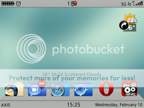
Awesome job!Obviously you gear this towards what you like but here are my 2 cents.I would move the weather slot to the upper right or left.Where it is now looks odd and isn't too wallpaper friendly.I would also remove the gray that the main homescreen icons sit on and just leave the icons.This would allow you to shift them a little more towards the bottom.I would try out the top and bottom banner in white or possibly clear.Once again thank you.The icons are great,no lag and I especially like the arrow letting me know what folder I'm on and the "new" label on my mail folders.Font size is perfect too.
Awesome job!Obviously you gear this towards what you like but here are my 2 cents.I would move the weather slot to the upper right or left.Where it is now looks odd and isn't too wallpaper friendly.I would also remove the gray that the main homescreen icons sit on and just leave the icons.This would allow you to shift them a little more towards the bottom.I would try out the top and bottom banner in white or possibly clear.Once again thank you.The icons are great,no lag and I especially like the arrow letting me know what folder I'm on and the "new" label on my mail folders.Font size is perfect too.
Well, glad you like it, and about the grey dock on the home screen and the weather slot, if more people agreed with it, I'll obviously change it . Cheers, thanks for the feedback.


 . Cheers, thanks for the feedback.