-

- 411
Ironically, some screenshots of 10.3 I’ve seen actually look more cluttered because of the missing contrast and visible components.
As a learning developer, I already experience this. It’s very hard to arrange and separate elements without some distinct visual cues. You can only do so much with lines and simple background colours, when you could easily add richer graphics and shadows to your arsenal. I’m experimenting a lot with this at the moment and I reuse plenty of BlackBerry’s custom components found in other apps, to make the user experience even better and maintain consistency with the 10.0–2 look. To me, the new design imposes some limitations to the freedom I currently have, if I want to have a common look with other BlackBerry apps (which I do appreciate).
Another worry is that I cannot control much of the new design without using the 10.3 API level. To retain optimal compatibility, you should use lower API levels if possible. Given that the design is different, existing apps will not necessarily look good on 10.3, especially if you use custom components with own graphics. This means that I either have to use the 10.3 API level, barring lower versions from using the app, create and maintain separate designs/apps for 10.3 or create a common design, potentially removing some 10.0–2 components. This is a challenge I am not really willing to make, given that this is new territory for me.
I still hold on to the opinion that BlackBerry 10 does not need this design update. Stick with what you’ve got and refine where necessary. But this shift from flat to even flatter and monotonous just comes at a cost at this point.05-22-14 04:07 PMLike 3 -
- 1,427
Completely agree with you. The UI was already minimal and profesional while maintaining the level of detail to distinguish titles, buttons and text. With this monotone flat design it looks like everything or nothing can be clicked; there's no easy way to just look at anything and automatically know what can and should be pressed.Ironically, some screenshots I�ve seen actually look more cluttered because of the missing contrast and visible components. As a learning developer, I already experience this. It�s very hard to arrange and separate elements without some distinct visual cues. You can only do so much with lines and simple background colours, when you could easily add richer graphics and shadows to your arsenal. I�m experimenting a lot with this at the moment and I reuse plenty of BlackBerry�s custom components found in other apps, to make the user experience even better and maintain consistency with the 10.0�2 look. To me, the new design imposes some limitations to the freedom I currently have, if I want to have a common look with other BlackBerry apps (which I do appreciate).
Another worry is that I cannot control much of the new design without using the 10.3 API level. To retain optimal compatibility, you should use lower API levels if possible. Given that the design is different, existing apps will not necessarily look good on 10.3, especially if you use custom components with own graphics. This means that I either have to use the 10.3 API level, barring lower versions from using the app, create a separate design/app for 10.3 or create a common design. This is a challenge I am not really willing to make, given that this is new territory for me.
I still hold on to the opinion that BlackBerry 10 does not need this design update. Stick with what you�ve got and refine where necessary. But this shift from flat to even flatter and monotonous just comes at a cost at this point.
Posted via CB1005-22-14 04:15 PMLike 2 -
- 2,424
BlackBerry simply cannot win. Whiners here simply won't quit. As soon as BlackBerry do something, all you hear is "I don't want my phone to look like android or ios".
You all have some sort of inferiority complex.
I personally like the look of my phone.

If android and ios are doing it and people aren't leaving them, maybe it shouldn't be that big of a deal me thinks
Posted via CB1005-22-14 05:13 PMLike 2 -
- 1,427
Read my post again. Nowhere have I said it looks like Android or iOS, nowhere have I complained or whined about that. I don't have an inferiority complex either, but you do know what I have? Enough sense to call a weak, monotone mess of a UI what it is; a lazy, unimaginative attempt at being different while still being similar.BlackBerry simply cannot win. Whiners here simply won't quit. As soon as BlackBerry do something, all you hear is "I don't want my phone to look like android or ios".
You all have some sort of inferiority complex.
I personally like the look of my phone.
If android and ios are doing it and people aren't leaving them, maybe it shouldn't be that big of a deal me thinks
Posted via CB10
Get your head of the sand and wake up. The UI is a bloody mess.
Posted via CB10peter0328 likes this.05-22-14 05:19 PMLike 1 -
- 411
That’s a false premise on your part. There could be lots of reasons why people don’t leave the ecosystem, even if the design is not to their liking. Users are not typically offered a choice either, it’s a take-it-or-leave-it deal. This combined with the general trend in mobile operating systems towards flat design makes any attempt to escape it pointless.
I personally don’t like the look of that screenshot. The clutter, the lack of contrast and mix of colours, yuck. 05-22-14 05:28 PMLike 2
 -
- 2,424
You are hilarious mate.. simply.Read my post again. Nowhere have I said it looks like Android or iOS, nowhere have I complained or whined about that. I don't have an inferiority complex either, but you do know what I have? Enough sense to call a weak, monotone mess of a UI what it is; a lazy, unimaginative attempt at being different while still being similar.
Get your head of the sand and wake up. The UI is a bloody mess.
Posted via CB10
Posted via CB1005-22-14 06:34 PMLike 0 -
- 2,424
From what I can tell it's almost an industry standard to be flat. Not just mobile platforms but websites started it. Being a Web designer, I remember my hs teacher hammering it into our ears that If we could afford images with gradients and used hex codes instead (flat 1 color) it's more welcome as it makes website load faster and gives a streamlined feeling. Mobile phones followed but it's been coming for a long time. Go on face book, twitter.. their site is flat.That�s a false premise on your part. There could be lots of reasons why people don�t leave the ecosystem, even if the design is not to their liking. Users are not typically offered a choice either, it�s a take-it-or-leave-it deal. This combined with the general trend in mobile operating systems towards flat design makes any attempt to escape it pointless.
I personally don�t like the look of that screenshot. The clutter, the lack of contrast and mix of colours, yuck.
Secondly it's a leak, not finalized. It will look similar but the icons aren't finalized. the wallpaper chosen does make a difference as I could show you a more clean look but wth I appreciate BlackBerry doing this. It's pretty much across the industry now and those ugly shadow boxes alone looked terrible.
Posted via CB10apodkos likes this.05-22-14 06:38 PMLike 1 -
- 9,702
-
- 2,424
-
- 411
I’d wager that it has a lot to do with a flat design’s adaptability for various screen sizes, which is becoming more and more important, and easy implementation with HTML, CSS and even SVG for vector-based imagery. Flat design, clean interfaces and adaptive layouts are hence considered good practices for web design, even from a usability point of view. It’s almost as if flat design is made for the web.
But you can only make so many assumptions when comparing web design with UI design. What is a trend on one, does not necessarily have to be a trend on the other. Where web design fluctuates, desktop UI design has been far more stable and became more advanced and design-rich where the technology allowed it. You can even see it on younger operating systems, like Ubuntu and Linux Mint.
What does trend mean on a mobile operating system anyway; when Apple, Google and Microsoft do it, does that imply a trend? You could argue that each of these companies had different motives for choosing that design. iOS 7 is more often seen as reflecting Jony Ive’s personal taste for minimalism and industrial design, Google has a strong presence on the web and implemented its corporate design into Android (if you compare Android apps with Google’s web apps that becomes particularly obvious) and Microsoft may have simply sought something so different and radical that only a flat design would have worked. That doesn’t mean that they are following or attempting to set a trend, but that they had their own reasons for adopting a flat design.
The same can be said about BlackBerry 10. The UI has been designed in 2012 and 2013, at a time where flat design was already established on mobile operating systems with the notable exception of iOS. What has changed since then?
Funny that you mention Facebook. If you look at the timeline pages and latest newsfeed, it seems that they are enhancing their predominantly flat designs with plenty of shadows, embosses and gradients. A few years ago I would have immediately agreed that their design is flat, now I’m not so sure.Go on face book, twitter.. their site is flat.ssbtech likes this.05-22-14 08:19 PMLike 1 -
- 1,881
Not trying to knock you down, but that mess is one of the reasons why BlackBerry put the.... "ugly boxes". They serve a purpose: to ensure that you can associate the icon above with the text below, and help to differentiate between the background and the interact-able iconsBlackBerry simply cannot win. Whiners here simply won't quit. As soon as BlackBerry do something, all you hear is "I don't want my phone to look like android or ios".
You all have some sort of inferiority complex.
I personally like the look of my phone.
If android and ios are doing it and people aren't leaving them, maybe it shouldn't be that big of a deal me thinks
Posted via CB10
I'm sure you like that look, but I feel that something is just wrong with such a busy screen.
Z10 STL100-1/10.2.1.2141anon8656116 and ssbtech like this.05-22-14 09:02 PMLike 2 -
- 2,424
Lol the background itself is busy and lousy. I've actually tried using the boxes without a dark background and it's just equally as lousy. Now check this.Not trying to knock you down, but that mess is one of the reasons why BlackBerry put the.... "ugly boxes". They serve a purpose: to ensure that you can associate the icon above with the text below, and help to differentiate between the background and the interact-able icons
I'm sure you like that look, but I feel that something is just wrong with such a busy screen.
Z10 STL100-1/10.2.1.2141
I can use any background and I know what to expect. With the boxes my background would have to be pitch black for those boxes to not be noticeable.


Posted via CB1005-22-14 09:56 PMLike 0 -
- 3,730
Eitot, you speak a lot of sense.
A little "Old and new". The old has some structure, well defined buttons and its visually interesting.
Last edited by ssbtech; 05-22-14 at 10:37 PM.
peter0328 and DaedalusIcarusHelios like this.05-22-14 10:20 PMLike 2 -
- 9,702
Please send this to Michael Clewley!!Eitot, you speak a lot of sense.
A little "Old and new". The old has some structure, well defined buttons and its visually interesting.
http://i1089.photobucket.com/albums/...psd9f09a24.jpg
Z10STL100-3/10.2.1.214105-22-14 10:44 PMLike 0 -
- 2,424
I personally fancy the one on the right. It's a matter of taste.Eitot, you speak a lot of sense.
A little "Old and new". The old has some structure, well defined buttons and its visually interesting.
http://i1089.photobucket.com/albums/...psd9f09a24.jpg
Posted via CB10JamBueree likes this.05-22-14 11:34 PMLike 1 -
- 3,730
I find it nearly impossible to read the icons and text on that screen against that wallpaper.
At first glance, I didn't even realize there were icons where the guy's head is.
Seeing the icons is fine, but what if you have multiple music, photo, browser or other apps? You'd want to have the name of the app clearly visible to ensure you're launching the correct app.
But the bigger picture here is BlackBerry forcing users into one UI paradigm with little to no choice in how users want their phone to look. If BB could get away with it, they'd have a wallpaper that you couldn't change.chalx likes this.05-23-14 12:07 AMLike 1 -
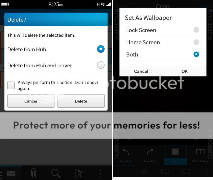
- 3,730
Ok, here's the difference for me.Eitot, you speak a lot of sense.
A little "Old and new". The old has some structure, well defined buttons and its visually interesting.
http://i1089.photobucket.com/albums/...psd9f09a24.jpg
The one on the left is very clearly a pop-up dialog box. The blue header and clearly delineated buttons further help to identify this as a box that is prompting for an action and input from the user.
My experience with the design on the right on various Android phones often leaves me not recognizing the difference between the box and the app running behind it. Often these boxes are of various sizes and appear in random places on the screen. Their lack of clear boundary lines makes it harder to immediately identify them as pop-up dialog boxes requiring an input.
My observation of people who are not "technically savvy" and who are using Android phones is that the poor delineation of UI elements results in them tapping parts of the screen that are momentarily inactive due to a dialog box waiting for input. This can result in frustration and confusion for the user when they wonder why it isn't responding to an input.
Don't be confused, the BlackBerry design isn't "dumbed down" but rather does a better job of communicating to the user that an input is required.
Elements with a limited variation in colours such as the box on the right can present as a more cluttered display as visual elements blend together.05-23-14 12:16 AMLike 0 -
- 602
05-23-14 01:01 AMLike 0 -
- 1,881


- Forum
- BlackBerry 10 Phones & OS
- BlackBerry 10 OS
10.3 UI design...
Similar Threads
-
10.3.0.296 Battery Charge Time
By SalMan50 in forum BlackBerry 10 OSReplies: 5Last Post: 07-04-14, 05:42 AM -
10.3 SDK finding
By Chuck Foltz in forum BlackBerry 10 OSReplies: 35Last Post: 06-15-14, 02:15 PM -
10.3 needs option to turn off battery low led!
By Ahmed Hanif in forum General BlackBerry News, Discussion & RumorsReplies: 29Last Post: 05-15-14, 11:01 PM -
Escreen for 10.2.1.2141: Help for Battery Chaging Screen
By karlonicolas in forum BlackBerry Q10Replies: 1Last Post: 05-15-14, 08:49 AM -
Did we loss shurtcuts in 10.3
By Ashraf Altayeb in forum BlackBerry 10 OSReplies: 3Last Post: 05-13-14, 10:22 PM
LINK TO POST COPIED TO CLIPBOARD