-

- 14
I really like what RIM did with the PlayBook UI for 1.x. After watching the DevCon and seeing the beta of 2.0 I'm not at all excited with the changes to the UI and I'll explain why and why I think the changes should stay closer to 1.x.
The new UI in 2.0 is much closer to webOS.
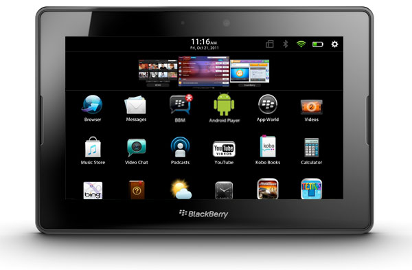
webOS 3.0 on the TouchPad Vs. PlayBook 1.x
The most noticeable difference is the "card" view, as it is called on webOS. This is the "carousel" view on the PlayBook 1.x. 2.0 will mimic webOS 3.x = enlarging the window so that one window takes up 70% of the screen with only part of two other windows visible on each side.
Slower Multi-Tasking
This will lead to slower multi-tasking for users. Why? Because the user will need to swipe left/right a lot more just to get the open apps into view before activating them. Having used webOS for a while I can tell you that this constant swiping around on the home screen gets old very quickly.
The minimal number of swipes/taps to get to a new app is increased with this model. On Android & PlayBook 1.x you never need more than 3 actions to get to any open app--often only two actions are needed. iOS requires at least 3 actions and never more than 4. webOS requires a minimum of 3 actions with nearly an unlimited number of actions required depending on how many windows you have open = slow multi-tasking.
This is a step backwards in usability especially for multi-tasking.
The PB 1.x UI allows a user to scroll through the entire carousel with a single swipe. This is very efficient. Secondly, it allows a user to activate any window within the carousel with a single tap even if it is not in focus. Again, this is very efficient.
No real additional info gained with enlarged windows.
Having a large window adds no benefit. You are seeing what you just left in your app with only a partial view of two other windows = no added information. You will need to swipe just to see the app to the left or right--you could have accessed it quicker via the open app and a left or right swipe.
Persistent home dock = redundant
The new persistent home dock in PB 2.0 makes no sense and seems to have come from a combination of webOS & iOS = straight copying for the sake of copying without any thought as to usability and efficiency in the UI.
Think about it for one second. Having a persistent home dock does nothing. You already have a first row or two of icons that would be at the top = "favorites" = "home dock."
Furthermore, by having folders you can make your first rows into tabs if you like or not. You, the user, have flexibility.
Finally, having this new home dock persistent across "tabs" is redundant. Do they think the user is so stupid that s/he will navigate away from it when in fact what they wanted was right there in the first row? So I get to look at this same row of icons all the time = taking up space on every screen. Copying apple here is just stupid and unnecessary.
Once a user navigates away form the current screen/tab they are making the willing decision that what they want is not in the current view therefore, having something persist into the new view is just plain arrogant of the UI designers--insisting that we users are so stupid that we will navigate away from the app we want to activate That they must ensure that our "favorites" are always in our face.
A cleaner UI for 2.0
Looking for images for this post I found a UI design already floating around that is close to what I would suggest for UI changes.
Keep the carousel
First, as noted above, the carousel needs to be kept. This is the fastest way for multi-tasking while still having enough graphical size of the window to be of value. If larger windows are desired then have them as a secondary option in the setting (large vs small windows).
Eliminate tabs & add folders
Having both tabs & folders is redundant. Furthermore, tabs take up screen space that would allow for a second or even third row of icons to be displayed when in the carousel view.
Folders would allow the user to organize as they see fit. They are not dictated to by the UI designers = user flexibility & choice.
More rows visible
Having more than one row visible when in the "carousel" view adds the ability to have more "favorites" in view without expanding the app launcher. This gives the user more "home launchers" and with folders this allows the user to have things organized for quicker access.
Looks cleaner
This approach has a much cleaner look than the current UI and the 2.0 UI while still allowing the user more flexibility to organize and access their apps & multi-tasking as quick as possible.
Cleaner! Faster! Simpler!
IMO this UI would be cleaner, faster for users to access apps & multi-tasking, and simpler to use.
What do you all think?
Update
I don't think I made myself clear enough as to the why I'm going with some of these changes.
One main consideration is, that the UI for BBX/PlayBook should NOT look like other tablet or phone UI's that currently exist.
2.0 looks very very similar to webOS. Too similar in my opinion. . . actually it's nearly identical.
Tabs are in webOS 3.0. They really are not needed when folders are available (though I understand some people like them), thus removing them and using folders helps BBX have its own distinct look and feel especially while maintaining the smaller windows (carousel view).
This is also true for the larger cards/windows--they are a direct knockoff of webOS. If you check the http://forums.precentral.net/ forums you will see many threads and patches about changing the size of the cards/windows--always wanting smaller and usually increasing the number of icons visible = people generally want access to more of their apps whenever possible, both for multi-tasking and launching.
The only distinctive look 2.0 has is the persistent home launcher, and that's only due to its persistent nature which mimics iOS's launcher thus we have many direct knockoffs of webOS 3.0 + iOS's persistent launcher. IMO it would be better to scrap the cards view all together and just go with icons like iOS if that's what their going for and make multi-tasking a secondary option like iOS and Android where it's hidden.
My attempt for this post was to demonstrate that users could have a more unique UI than what is currently available while still having it be very easy to use, very fast multi-tasking, with a very clean and simple look. Not to make things into an argument of, "but I like ____"
Everyone likes things a little different and that's something the UI designers can consider in settings. What I'm attempting here is to look at what presents well and what allows for maximum user efficiency while remaining very clean, simple to use and understand thus, it is a case of some sacrifice in some areas to gain benefit in others. None of us have everything we want but we may all have a very useful & elegant UI that is NOT a ripoff of webOS & iOS or an ill-conceived attempt at a mix-mash of the two.
And I do understand that this OS will go for phones & tables. . . maybe more. That does not mean the UI should be sacrificed on one form factor for another.
Thanks
Update 2
As others have stated on another thread, this would all be mute if RIM seen fit to allow themes or customization of the UI by developers or even settings for users to enable/disable certain UI features.Last edited by PBBBX; 10-20-11 at 06:57 PM.
10-19-11 11:34 AMLike 13 -
- 43
I like the 1.x UI way more than the 2.x. I hope this isn't the finished product. I was hoping from more from RIM than... this.10-19-11 02:58 PMLike 0 -
- 110
Great post and good information as well. Although I have not yet worked with 2.0 I can see how it could be problematic, thus the options you have posted are very interesting.
By the way, thanks for making it an enjoyable read and not a negative rant.10-19-11 03:07 PMLike 3 -
- 175
I actually find the 2.0 UI more user friendly. Also, I think we are also missing the point. They are unifying phone and tablet UI experience and I really can't see how the old tiny preview windows would be any useful on a phone.10-19-11 03:15 PMLike 3 -
- 564
Talk about hitting the nail on the head, right there...BBX is RIM's version of Ice Cream Sandwhich - the one-stop shopping for developers and their apps to play nice between phone and tablet. Tablet OS 2.0 is a bridge between the rushed QNX Tablet OS in order to get the PlayBook on the market and the refined BBX...
My guess is some of this stuff will start to make a lot more sense in about 6 months, assuming the new BBX phones don't experience any more delays...about 3-4 months after they start launching, the synergies between tablet and phone will start to become apparent, and welcomed.LuayS and world traveler and former ceo like this.10-19-11 03:25 PMLike 2 -
- 14
If you look at some Android app launchers and skins you can find several examples of where carousels are used and while the view isn't as large they are useful to give you and idea of what the app is. No, you will not be able to see everything that is going on in that window however, the usability of navigating the device isn't increased with the new structure.
Let me give you an example.
If I swipe from the left bezel I can instantly access the next app running to the left of the current app. This is true for right navigation. This gives me the ability to move one app at a time and see a 90% size view. That is no different than the new 2.0 window view--the only difference is you are viewing the window at 60-70% instead of 90%.
In other words. It doesn't add any real usefulness that isn't already available to the user.
As for the unified experience. . .
Yes, I do understand that. However, as Android is demonstrating with Ice-Cream Sandwich, they do not need to sacrifice usability of one form factor for another. The OS should compensate for that and make each form factor as usable as possible. Not make it one homogeneous OS like iOS.Last edited by PBBBX; 10-19-11 at 03:29 PM.
10-19-11 03:26 PMLike 0 -
- 77
Great post. I had a lot of the same thoughts yesterday when looking at the 2.0 preview except you said it a lot more concisely than I could have. I actually like the existing 1.0 interface a lot. Pretty much the only thing I thought was missing was folders so I didn't expect a total re-design. I'll hold off passing judgement until I have the release version loaded on my PlayBook but I'm less excited about 2.0 than I was a couple days ago.10-19-11 03:28 PMLike 0 -
- 1,413
I find using the dock with folders faster to use. I thought I wouldn't like but using it is a different story.
Its nice to see RIM try new things but hopefully they will have a setting for a full carousel. I'd even like a carousel like linux compiz does cubes.Last edited by dentynefire; 10-19-11 at 05:20 PM.
10-19-11 05:08 PMLike 0 -
- 1,187
By the same token however, why cripple a 7" screen to mimic the phone UI? I really hope the UI on either device gives the best experience for the device it's on.10-19-11 05:17 PMLike 0 -
- 204
You do realize that they also added more functionality to the swipe right? Using the bezel swipe you can control how much of the other application you see, that way you don't have to switch from one to the other if you just want to look at something quickly (kind of like the picture application)
Also, let's say you have 3 applications open and you're in the first one, in a single bezel swipe you can skip the second application to go to the third one.
I actually do like the new UI but would love to have the option to choose between tabs and the new look as well as be able to control the size of the each window.10-19-11 05:27 PMLike 0 -
- 910
I watched Kevin's video from DevCon on the new UI and my overriding impression was that PB was moving towards Apple's UI. Am I alone in thinking this? It really wound me up watching the video as Mr Bobblehead from RIM made it sound like great leaps forward, which they might have been but for the fact Apple was there ages ago. Have I misunderstood how it works?10-19-11 05:30 PMLike 0 -
- 1,413
Yeah a customizable carousel would rock (size and # of windows). Would make most people happy tooTPwebOS820 likes this.10-19-11 05:49 PMLike 1 -
- 14
Absolutely! Giving people options of how they want the UI to work for them would be the best bet. . . I just don't see that happening.
Some simple check options in settings under "interface" like
include tab headers
user smaller icons
user large windows
A somewhat flexible UI. . . who would think of that") 10-19-11 07:47 PMLike 0
10-19-11 07:47 PMLike 0 -
- 951
After a days use i like 2.0. Folders and tabs is far better then favorites, media and all pages.
Its the Same interface as 1.0 but aligns more with what people expect in a tablet.
ideally they will let us theme the pages and choose between them.10-19-11 09:54 PMLike 0 -
- 95
Seriously before everyone freaks out, I feel everyone one of you that's ******** try out OS2. It Fa nominal. I'm really impressed with what they've done.10-19-11 09:58 PMLike 0 -
- 3,730
What sort of folders do people create? I'm assuming one for work apps, one for media apps, another for games, etc..
Simply allow the renaming of the tabs so people can have a tab for Work, a tab for media, a tab for games and you'd make everyone happy.
One tap on the tab and you've got what you need. Want a different tab? Just tap it. No need to close a tab first.10-19-11 10:00 PMLike 0 -
- 14
I've updated my post to clarify why I chose some of the things I did.
I do understand that some people will like x over y, etc. . . But we can't all have everything and it's about finding a balance for BBX that makes it user friendly and distinctive amongst the other tablet/phone operating systems. . . otherwise you might as well buy the OS that's being copied.
So, yes. . . some will like larger windows. Some will like the tabs, etc.
And an intelligent UI design would have setting to change some of these aspects for the users allowing them to get it exactly as they want it. However, there ought to be a default UI that is unique, simple, clean, easy to understand & use. . . IMO10-20-11 09:19 AMLike 0 -
- 14
The problem with tabs are three fold.What sort of folders do people create? I'm assuming one for work apps, one for media apps, another for games, etc..
Simply allow the renaming of the tabs so people can have a tab for Work, a tab for media, a tab for games and you'd make everyone happy.
One tap on the tab and you've got what you need. Want a different tab? Just tap it. No need to close a tab first.
1. once the name exceed the screen what then? A second row of tabs? This would be cluttered for those who want/need many tabs/folders. Thus, it doesn't have the sheer flexibility folders do.
2. it takes up a row that could be used to present more icons & folders on the first swipe = faster access to two or three rows of "favorites." This means the end user ultimately is the one in charge of the look & feel more so than designers.
3. it is a direct copy of webOS 3.0.
Could it be an option in settings? Sure! Should it be the default face of BBX? IMO it's a more complicated approach that some users, believe it or not, are confused with and also sends a message that BBX is unoriginal and copying webOS.
Just my opinion.Last edited by PBBBX; 10-20-11 at 09:32 AM.
10-20-11 09:28 AMLike 0


- Forum
- BlackBerry PlayBook Forums
- BlackBerry PlayBook
A Better UI for 2.0
LINK TO POST COPIED TO CLIPBOARD