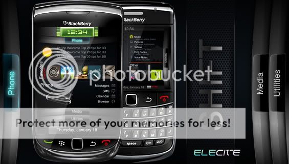
One of our latest and most successful themes, Shift, is now available on Elecite as well as AppWorld
Since launch date, we've released several updates addressing some of the feedback provided so if you haven't upgraded, just login to your Elecite/AppWorld account
PS: Our refund policy is simple: Buy it and try it; don't like it, get full refund!
Shift is a BlackBerry theme sporting 3 Panels, 3 pages that get you to everything you need on your BlackBerry with efficiency and style.
Shift packs a punch:
The first Phone Panel displays your 5 top icons, 4 popular standard icons, a weather slot (for Storm and Torch devices) and a Today preview so you won't even have to open your messages and calendar apps to view their contents.
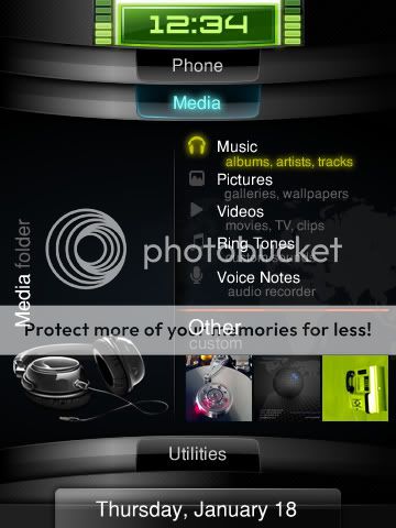
Panel #2 makes viewing and with Media extremely enjoyable. 5 icons get you to all of your Pics, Music and more instantly with customizable icons when you need them.
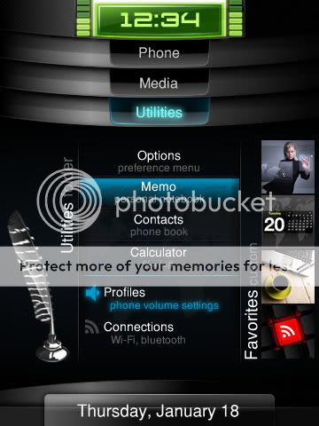
On top of that, the Utilities Panel brings up all of you apps, quick notes and calculator. A bonus 6 customizable icons allow you to make this tab extremely personal.
♦ Practical design
♦ Clean, simple and professional
♦ 3 page design
♦ 12 customizable icon dock
♦ 15-16 locked quick access icons
♦ Polished dash board interface
♦ Fast and snappy
Great theme, only thing I would like to see changed is that when a email notification comes in something like an asterisk or anything to let me know which email account has the mail cause when I look on my main menu all I see is 5 emails and have to go to each one to know which one got the message
I second the request to have badges put back into the icon set, so that when anything updates, I have some idea of which app to dig into. Also, on the Utilities pane, when I select Memo, it activates the Today area up top and jumbles the screen with an overlay of my memos. I imagine this isn't intentional.
And last, a question: why does the summary claim that the utilities pane has 6 customizable apps? I only see 4.
Not sure how I feel about this. The fonts in the menu are too big, much too big. My messages in BBM follow the device font, but the list of contacts in BBM follow the theme font. Also not crazy about the icons.
Not sure how I feel about this. The fonts in the menu are too big, much too big. My messages in BBM follow the device font, but the list of contacts in BBM follow the theme font. Also not crazy about the icons.
Otherwise the font is great.
Definitely agree with you on that. The default font size needs to be reduced a couple of sizes, most of the messages in my inbox are cut off half way.
Shouldn't the BIS indicator be next to the WiFi indicator?
I noticed this as well. Seems this indicator only moves down above the icons when you have wifi enabled.
Also...I as well downloaded/purchased this theme off of app world. Will upgrades be made available this way seeing as how I didn't purchase off the elite website?
We've released 1 or 2 new updates since the theme was launched. If you purchased it via App World then you'll be able to get any updates via App World as well.
We addressed a few concerns and issues in the updates however, the menu font hasn't been changed. We've received a great amount of emails to keep the fonts larger rather than smaller.
I'm using version 1.5, which after a few updates I'm still seeing some problems.
First, the selection bracket (the red square) is not in the right position during the application switching screen (after the long press of the blackberry button). It's not centered, whereas the icons are, and is shifted up instead. Sorry I have no ways of taking a screenshot since it's the application switching screen, and unfortunately I have no other camera to take a photo of my phone!
Second, the font color of the start page in the browser is not visible under list view. The title of the bookmark/history is black, which is the same as the background. To see the title of the bookmark/history, it would have to be selected first.