- Forum
- BlackBerry OS Phone Forums
- More for your BBOS Phone!
- BlackBerry Themes
- BlackBerry Bold 9700 Themes
[mo14k] NuKonsept!! THE BLACKBERRY REVOLUTION TO THEMES!!!
-

- 44
SORRY THE BETA DOWNLOAD LINK HAS BEEN TAKEN DOWN AS THE CURRENT VERSION IS TOTALLY DIFFERENT!!!
ALSO, SORRY FOR THE DELAY FOR THE RELEASE, BEEN SOOO BUSY WITH LIFE AFFAIRS!!! LOL
Hey People... I'm working on a new theme.
Thought I'd try and think outside the box, hopefully nobody has had the idea yet... lol...
Please remember this is the second Theme I've ever made. The first is Complic8
So please go easy on the criticism, lol. Nevertheless, don't hesitate and hold back, to say it as it is. (If that last sentence even makes sense, lol)
NuKonsept
My intial ideas were:
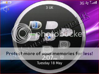
*Clickable clock
*Clickable signal for "connections" or "options/settings"
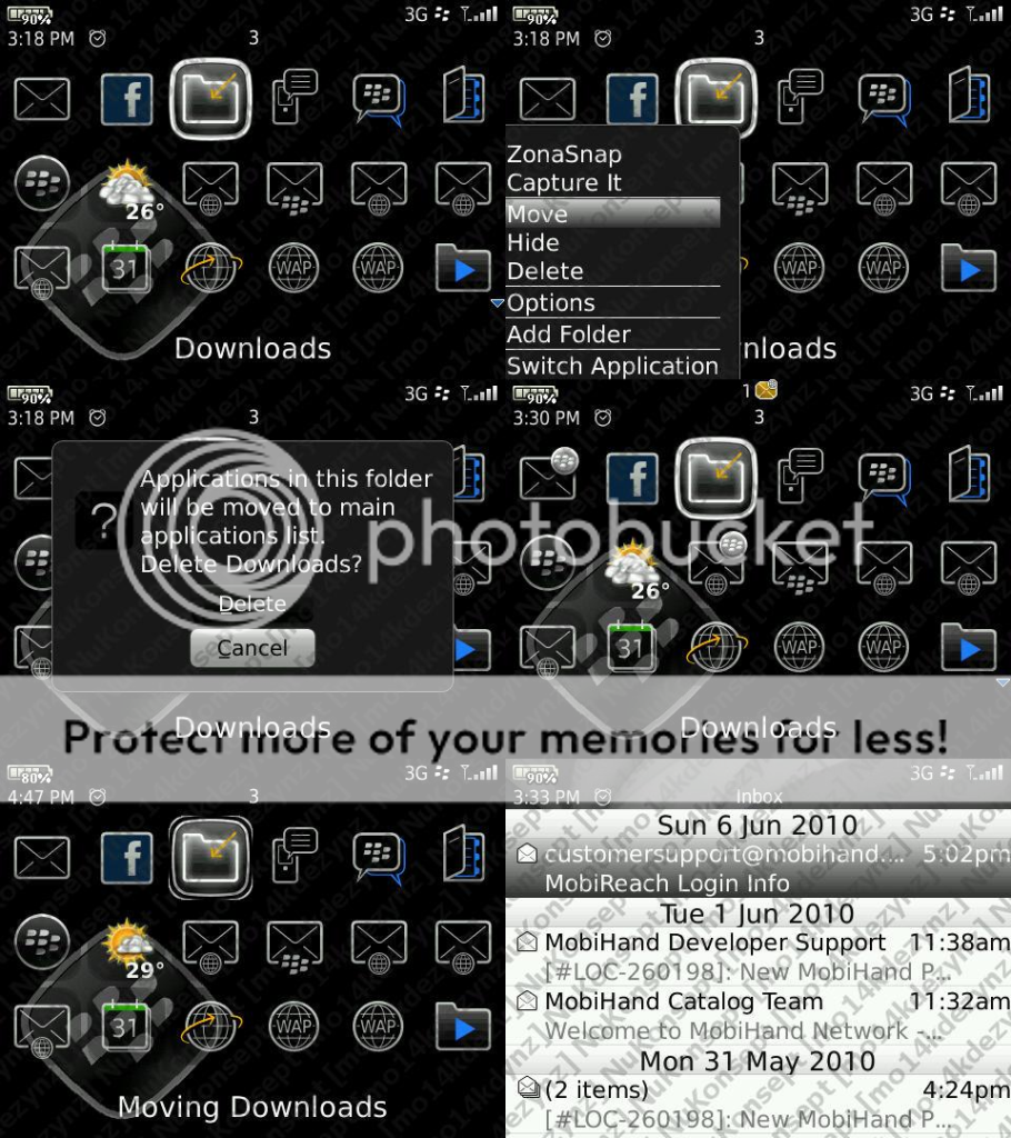
*Maybe make the 3 sets of Berries as Hidden Icons using:
Left 2
show: Caps+I hide: Alt+I
Middle 3
show: Caps+O hide: Alt+O
Right 2
show: Caps+P hide: Alt+P
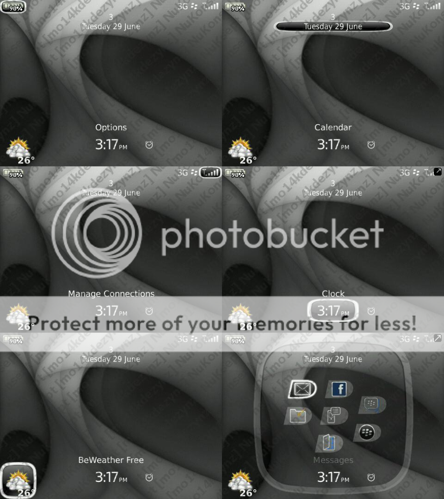
The current progress:
(With the BB logo provided by serversurfer. Thank you SO MUCH DUDE!!!)
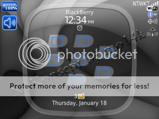
**I decided to change the Circle to a Circular edged Square which does make it look better.
**I played around with the berries in order to get a focus tab for the Homescreen Icons.
**Changed the battery to show a percentage.
**Clickable Clock which is a hotspot for Clock.
**Clickable Date which is a hotspot for Calendar.
**Clickable Signal which is a hotspot for Manage Connections.
**Clickable Battery which is a hotspot for Options.
**The BB Logo and the icons are hidden so the theme can be Background friendly. Space will show. Espace/Arrow will hide.
**Modified some of the MenuScreen Tabs and underlays and changed the Notification star.
**$ is a Hot Key for SMS/MMS. For US/Dollar users.
**� is a Hot Key for SMS/MMS. For UK/Sterling users.
**Caps+P is a Hot Key for Profiles.
**Caps+Q is a Hot Key for QuickLaunch.
**Changed the colour scheme/gradient for the menus, commands and buttons.
**2 Versions: With Weather Block // Without Weather Block
Future Plans:
**Currently editing it in other colours, so don't worry! Lol! Intend on releasing all of the colours together: White/Grey, Red, Blue, Green, Pink.
I hope it can cater to everyones wants...
I don't know what else... suggestions are welcome and MUCH appreciated...
1st & 2nd Idea:
Current Look:
Thanks for looking!! I look forward to some feedback!!!
MUCH MUCH APPRECIATED!!Last edited by mo14k; 06-29-10 at 11:09 AM. Reason: UPDATE
05-19-10 06:46 PMLike 0 -
- 15
Luv it just downloaded will report back. Alls good rite now
Posted from my CrackBerry at wapforums.crackberry.com05-19-10 07:36 PMLike 0 -
- 2,818
-
- 44
Thanks Look forward to hearing your feedback and opinions
The problem with bigger icons, is that they won't fit in the berries, then if the berries are enlarged, the tab won't fit on the screen.
About the colors, quite a few have suggested red. So definitely intend on releasing Version 1.0 with different colours
Thanks for the comments
Lol! Thanks once again for the BB tab!!!
A new idea jumped into my mind this morning. For all the weather app users, I intend on having a Weather Version with a weather icon (Standard size) in the bottom left or right corner, which will be visible at all times!
Posted from my CrackBerry at wapforums.crackberry.comLast edited by mo14k; 05-20-10 at 09:03 AM.
05-20-10 04:47 AMLike 0 -
- 194
It's great Mo! I really like the focus tabs, goes nice with the BB logo. I was going to suggest a weather slot, but I think it looks really cute and clean to have the weather icon in with the other icons actually.
As far as criticism, I don't have any really! I do think that it might look cleaner with the profile icon gone? If someone wants it on the homescreen, they could always put it in the icons. Oh and the OCD in me would say to bump the battery meter up towards the top just a skosh, lol.
Very nice05-20-10 05:50 PMLike 0 -
- 44
Hey FerfiousIt's great Mo! I really like the focus tabs, goes nice with the BB logo. I was going to suggest a weather slot, but I think it looks really cute and clean to have the weather icon in with the other icons actually.
As far as criticism, I don't have any really! I do think that it might look cleaner with the profile icon gone? If someone wants it on the homescreen, they could always put it in the icons. Oh and the OCD in me would say to bump the battery meter up towards the top just a skosh, lol.
Very nice So happy about your comment I love the tabs too. I intend on blackifying the blue berry tab aswel, like the 1st Draft Icons but only a bit better so it can go with the whole theme.
I actually agree about the Profile Comment... I'm definitely considering that already, lol.
I'm quite OCD and after you pointed that out I straight started modifying its position. lol. Problem is it has to be as cornered as possible without messing the tab focus look. So it make it more symmetrical, and please the OCD 1s out there I'm going to modify the connections' position to the same plane.
With the weather icon issue, I do intend on releasing it with a standard sized weather icon in the corner which wont hide like the other icons.
Thanks again for the in-depth feedback
How does it run? Smoothly hopefully?05-20-10 06:18 PMLike 0 -
- 1,314
Very unique! I'm hot for the red as well. Gonna give it a spin! I know its beta and looks like it will sell but will you offer it free or premium? Why the beta imprint across the screen? Love the layout and the concept. Gonna run this solely to guage memory, lag, battery and response. Will get back with you later. Thanks., Starting now with full battery.
Posted from my CrackBerry at wapforums.crackberry.com05-20-10 07:03 PMLike 0 -
- 1,314
Love the shape of icon indicator. I like the current color scheme but would like to options for additional colors. Definately love the clear tabbing used! I prefer transparent highlighting and menu selections. Moving up battery indicator as previously mentioned. Would like to see user customizable font size and selections and when can I expect this! (Smile) That's it so far!
Posted from my CrackBerry at wapforums.crackberry.com05-20-10 07:35 PMLike 0 -
- 44
Hey! Seems like everyone is really digging a Red version! That will definitely have to be the 1st colour from the different coloured lot.Very unique! I'm hot for the red as well. Gonna give it a spin! I know its beta and looks like it will sell but will you offer it free or premium? Why the beta imprint across the screen? Love the layout and the concept. Gonna run this solely to guage memory, lag, battery and response. Will get back with you later. Thanks., Starting now with full battery.
Posted from my CrackBerry at wapforums.crackberry.com
I'm not so sure about selling at the moment, I'm just concentrating on developing the theme to its best.
I duno what the watermark is for lol, think i just was getting a bit excited on Photoshop lol!
lol!
Thanks alot for the time you're willing to spend to help me
Thanks so muchLove the shape of icon indicator. I like the current color scheme but would like to options for additional colors. Definately love the clear tabbing used! I prefer transparent highlighting and menu selections. Moving up battery indicator as previously mentioned. Would like to see user customizable font size and selections and when can I expect this! (Smile) That's it so far!
Posted from my CrackBerry at wapforums.crackberry.com I'll probably use user customizable font size.
When to expect it... hmmm.... Dunno, lol... Want to make it flawless before publishing it... But am spending a fair bit of time on it... so soon Will keep you updated
Thanks so much once again for the help!!05-20-10 07:52 PMLike 0 -
- 2,818
In my opinion i look out of the window to check the current weather... The worst case will be happen, when i i want to know the weather of other places. Then i will impose the challange to open a file. I HATE weatherslots! They disturb/ destroy the cleanness of any scheme! ;-)
Posted from my CrackBerry at wapforums.crackberry.com05-22-10 10:02 AMLike 0 -
- 1,314
Haven't heard from you! Looking forward to update to this one! Did you remove watermark? Ha, just kidding. Any new reports of ETA.
Posted from my CrackBerry at wapforums.crackberry.com05-22-10 10:14 AMLike 0 -
- 314
-
- 263
Like the look, for a slightly glossier approach could add some silver to the Berry symbol.
The WiFi indicator overlaps the coverage bar a tad.
You could use the coverage bar as a short cut to Manage Connections for a little more homescreen functionality.
Runs smoothly. Everything works that I can find to play with.
Not bad for a Geordie !05-30-10 08:29 AMLike 0 -
- 40
New version is so promising. I really love it!
The app screen is such a pleasure with the new icon highlight. Love the roundness.
Only slip ups are with the sound profile, battery and clock selection...it just looks rushed to have a stretched out version of the app screen icon highlight.
Also, how about a true black menu/pop-up -- maybe with a semi-transparent white strip as a border-- or just basic black and semi-transparent all around?
Anyhow, I'll be on the lookout. Nice job!!
Posted from my CrackBerry at wapforums.crackberry.com05-30-10 09:56 AMLike 0 -
- 2,818
Whats happend to mo? We are waiting for the offer of his genius theme...
Posted from my CrackBerry at wapforums.crackberry.com06-11-10 11:14 AMLike 0 -
- 44
Does it honestly look stretched?
There are update pics on the menu/pop-up on the Original Post.
Noticed the WiFi issue = dealt with now.
Coverage hotspot issue = done.
Berry Signal as silver = done.
LOL... Im not a Geordie, but study in Newcastle lol...
Sorry been soo busy!!! It will be Released REALLY Soon!!!Last edited by mo14k; 06-29-10 at 11:30 AM.
06-29-10 10:18 AMLike 0 -
- 2,818
The main thing is, that you are allright and healthy...!!! Everything else is a bonus...;-) And therefore everybody has to show patience! :-) Good things need time, perfect once need prudence! ;-)
Posted from my CrackBerry at wapforums.crackberry.com06-29-10 11:59 AMLike 0 -
- 2,818


- Forum
- BlackBerry OS Phone Forums
- More for your BBOS Phone!
- BlackBerry Themes
- BlackBerry Bold 9700 Themes
[mo14k] NuKonsept!! THE BLACKBERRY REVOLUTION TO THEMES!!!
LINK TO POST COPIED TO CLIPBOARD