i dont think those are the new torch. if rim is going to continue to make the torch line is possible they stick with the slide phone. half touch screen/half keyboard slide.
i dont think those are the new torch. if rim is going to continue to make the torch line is possible they stick with the slide phone. half touch screen/half keyboard slide.
Sent from my BlackBerry 9900 using Tapatalk
The 9850/60 are full touch under the Torch name. I'd expect the slider (if there will ever be one) to be rebranded under a new name.
Not entirely happy with the design I was kind of wishing it would've looked more like the dev alpha but hey I guess RIM is trying to aviod the whole Apple patent thing.
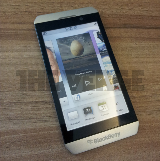
If you look on the bottom right you can see a pin - 2A2DF6E8
Someone is getting NDA raped right now
And thank god it is not that square edged thing. No 14 year old girl will buy something that looks that stupid. Sorry. Just being honest. You want ot regain market share? Listen, even CEOs care about style to some extent.
I like it a little, I need to see the back, on a slab of glass, it is the back and edges that define it's style how much can the look of the glass change.
Why are these names being recycled? It would make sense if the brand had some sort of street credit in North America, but it does not. Maybe the Bold but the Torch is antiquated.
Would have been nice to see a departure from the usual. BB's names are still well enough known, at least from people I know, that sticking with them will leave a first impression of more of the same. That's the absolute last thing that RIM needs.
I sure hope the LED is at the top and cut off from the picture because I can't see one. Or maybe it's hidden behind the top panel like the S3. Either way.......I need one on my BB10!!!!!