Just bought it and I think is awesome , one thing that I think is missing is the notification bar. is there anyway you can put the notification bar in the upper part of the screen just like the android? that would we neat as **** and convenient.
This theme is simple and looks great! I just don't like how when the icons are minimized, the menu button only functions as opening up the rest of the icons and nothing else. I wanted to take a screen shot of my home screen but couldn't.
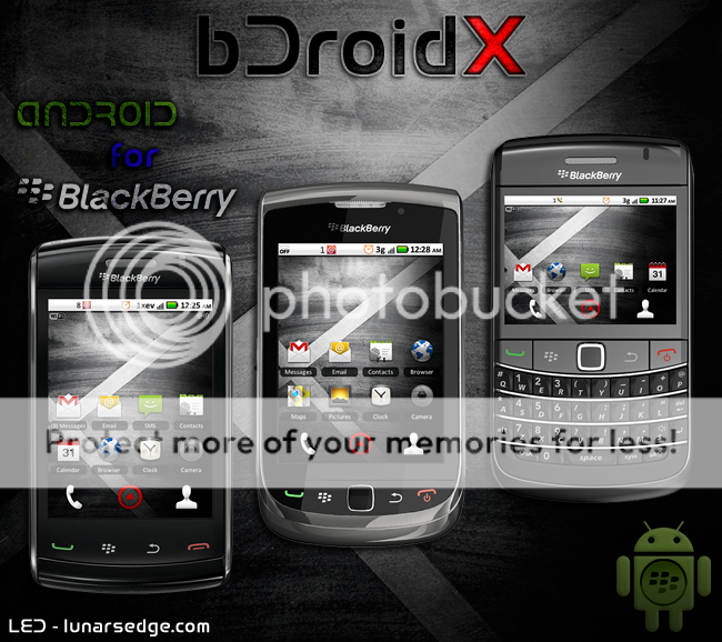
There's no landscape mode for this, turning to landscape moves the screen to the left side with a big white area on the right. Turn it back to portrait and it goes to the app screen.
Just bought it and I think is awesome , one thing that I think is missing is the notification bar. is there anyway you can put the notification bar in the upper part of the screen just like the android? that would we neat as **** and convenient.
If you mean the notification icons that show when you get a message, ect., that is already there.
This theme is simple and looks great! I just don't like how when the icons are minimized, the menu button only functions as opening up the rest of the icons and nothing else. I wanted to take a screen shot of my home screen but couldn't.
The icons were sized smaller according to the actual DroidX device.
The middle dock menu button is also functioning as the original DroidX device has it, going to the app menu.
Can you set a keyboard or convenience key to launch your snapshot app?
There's no landscape mode for this, turning to landscape moves the screen to the left side with a big white area on the right. Turn it back to portrait and it goes to the app screen.
This is a common bug that developers are getting. Working on a fix, but may not be updated till the Software goes out of beta. Don't worry it will be remedied in a future update.
The same thing happened with the Storm device in the app menu when OS 5.0 came out.
No, that is not what i Meant. What i meant is the notification bar on OS 6 is missing on this one. the bar that you click and you can see the calendar and RSS, emails, bbm etc...instead now you have to go directly to the app and open it just like 5.0. My suggestion was to put the same bar from the original OS 6 theme in the upper part of this theme.
Originally Posted by jerde
If you mean the notification icons that show when you get a message, ect., that is already there.
No, that is not what i Meant. What i meant is the notification bar on OS 6 is missing on this one. the bar that you click and you can see the calendar and RSS, emails, bbm etc...instead now you have to go directly to the app and open it just like 5.0. My suggestion was to put the same bar from the original OS 6 theme in the upper part of this theme.
I'm disappointed in this theme. I purchased it. Yes for .99, but i find it hideous. The picture u have looks good, but once on the device, i fine it terrible. it looks all scrunched up on the application banner which is a major disappointment for me. It's too bad it's not better because it would have been a great theme for me. I can't believe I purchased it now.
I just tried this out. I like the look a lot. The biggest thing I noticed is that when I'm using the trackpad in the menu that if I scroll to the left the cursor disappears.
Posted from my CrackBerry at wapforums.crackberry.com
On the stock theme, from the application menu, the calendar displays the correct date, but on this theme, it displays the 28th... Why does it not keep in sync like the stock theme?
I'm disappointed in this theme. I purchased it. Yes for .99, but i find it hideous. The picture u have looks good, but once on the device, i fine it terrible. it looks all scrunched up on the application banner which is a major disappointment for me. It's too bad it's not better because it would have been a great theme for me. I can't believe I purchased it now.
What you see in the picture should reflect on your device. What do you mean by scrunched up? Can you post a snapshot, as perhaps there is something else going on.