Hey guys, this is my first attempt at a 95xx theme, and its a little more than the ones I had done for a 4.2 Pearl. The name "FOUNDATION" is because it is the foundation of future themes I would like to work on. It has been a definite learning experience to start with composer.
******Launching as a v1.0 release.
Again, thanks to everyone for feedback during the beta process.
I did the desktop download and tried to load it. In Desktop Manager I get the message "Error...This application is not compatible with your device and cannot be loaded"....
I have a Storm2 9550 running .320....Any suggestions?
I did the desktop download and tried to load it. In Desktop Manager I get the message "Error...This application is not compatible with your device and cannot be loaded"....
I have a Storm2 9550 running .320....Any suggestions?
No clue, according to Theme Builder, its a 95xx built theme.
I had the same problem using BB desktop manager. I was able to install this theme with bbsak. Worked perfectly for me. Love the way this theme looks too!
I had the same problem using BB desktop manager. I was able to install this theme with bbsak. Worked perfectly for me. Love the way this theme looks too!
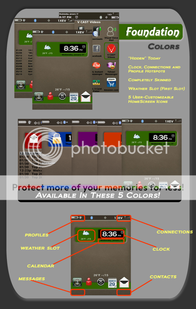
sent question to other themer to get you SSID field name; hopefully will have for you tomorrow. Important for us Wifi users to have it displayed - to ensure that we're connected to a network without just having the Wifi signal burn battery looking for one.
In terms of hotspots, the ideal others would be calendar (on date display) and phone book & messages - all on home screen.
I researched how, and added the hotspots you suggested. If I can figure out, of you can figure it out for me, I will of course add an SSID field.
I'm diggin this theme. Downloaded and so far everything is great. Goes well with BerryWeather too. Any different colors in the future? Ill be using this one for awhile.
Posted from my CrackBerry at wapforums.crackberry.com
this looks interested and I'm craving something different... gonna try it out
*dloaded fine, and runs quite well. I like it a lot. My only suggestion would be for slightly larger text on the today items. You may even have to cut one or two lines but it'd be well worth it to see them, lol. Otherwise, Great Work!
While increase Today section font and add SSID in the next update. Thanks
all of the above; I noticed it on the dialing display screen, but I'm assuming you did the same for the caller id stuff, which by default in all of the theme designs is too small as well. the smaller font doesn't make it more elegant; just more challenging to read . . . . especially in caller ID mode, the display should jump out at you.
there's plenty of place on both those screens, and a larger display would serve all.
Fully agree that smaller font = less elegant, but that's just in general w/ all themes. But the caller ID especially, IMO, font should be as large as possible. It's a "quick glance" screen so it really should jump out at you.
Fully agree that smaller font = less elegant, but that's just in general w/ all themes. But the caller ID especially, IMO, font should be as large as possible. It's a "quick glance" screen so it really should jump out at you.
Apparently, RIM thinks we have lots of caller info for each of our contacts. I increased the fonts to the point that it could be, without cutting off anything.
SSID should be working. Don't have an S2, so I can't check.
I am launching this in all colors. I will still correct any bugs, but preference changes will probably have to wait for awhile. This has been an exhaustive process, but one I feel good about.
Thanks to all who helped or contributed in any way. Enjoy!