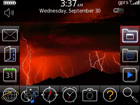
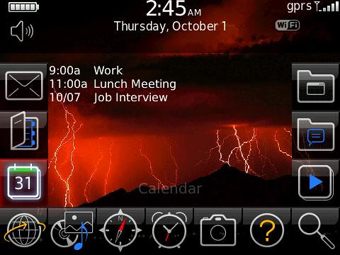
This is a U shaped theme with 13 customizable icons. It's modeled after the storm with a twist. Here's a few pics. If anyone has any changes they'd like made, let me know and I'd be happy to work on them. So here you go:
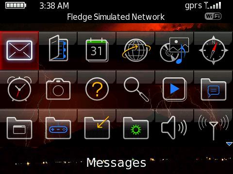
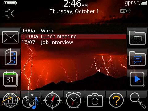
Ok guys, went ahead and added the hidden today preview. It has up to 8 entries and you can scroll right, left, or up depending where you are to get to it from everywhere except icons 4 and 10. Here's some pics and the link to the OTA:
wow this theme is AMAZING!!!! thats a lot for your hard work!!!
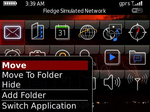
after reading some of the comments on other themes, there are two things that may make it better...
1) a way to see which network they are connected to on the home screen (maybe right underneath the date)...by that i mean like...T-mobile - <wifi network connected>
2) the menu text is pretty large. if you can reduce the text size that would also be a plus for this theme.
like i said this theme is VERY VERY nice!!!
great job and thanks a lot!!
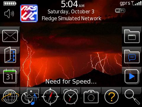
Here is a link for the theme with smaller menu text (Font 25 instead of 30) and the network on the home screen. I did have to move the message icons, but at least 5 should still show up! I'm assuming you were talking about the Zen theme, if you want the same on the today, let me know!
The menu text is smaller. Is is possible to get it to be even smaller...just a tad bit more. I really hate to ask you to do this because I have tried to make themes and I know how hard and time consuming they are.
I really appreciate everything you have done thus far and the theme looks great.
I think that last link you posted does not have the hidden today. Somehow it got deleted? Or is it just my phone? Could you decrease the font on the today too?.
If there is space next to the profiles icon, could you add a weather slot?
One last thing...I promise!!! The clock on the home screen is getting cut off at the top. I noticed that there was some space between the bottom of that top banner and the first icons on the left and right (the tips of the U). Could you pull the banner down and move the date, network, clock down so that the clock doesn't get cut off?
Once again if you can't do this I completely understand. Thanks for all your hard work!!!
Posted from my CrackBerry at wapforums.crackberry.com
I will sure give it a try to get all your requests in, I do have to work today, but as soon as I get home (and the ole lady off my a$$), I'll jump on it. I do see where the time is a bit high. I don't have a curve so I only tested this quickly on the simulator, so I thank you for your suggestions. What I'll do is make the theme with the fixes before I attempt the weather slot. I've never do that before but will try!
Thank you sooooooo much. The world is greatful to have people like you
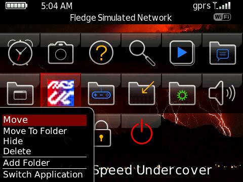
While you are at it, you can probably move the profiles icon and the battery bar a little down to make it look cleaner and more centered.
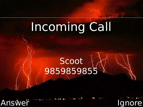
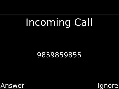
This will probably take away from your theme but...is there a way to change the incoming and outgoing call screen to just all black background instead of the red storm?
Posted from my CrackBerry at wapforums.crackberry.com
This has everything including the weather slot! What you have to do is set whatever weather program as your 14th icon. Then you can scroll up from the today text or right from the profiles icon. It's preview, small text, small menu text, time-profiles-battery all moved down! Let me know what you think!
I read about the weather icon and it seems like a pain! Plus I would need the exact module of your program, I figured this would be a little more multi user friendly. I really hope you enjoy! Please check out my site, maybe hit up some ads! LOL thanks man!
thanks a lot man...you really helped me out. ive been looking for a theme where i can have many icons on the home screen with a hidden today plus a weather slot!! this is great
some of the menu screens are still a big large...for example when you click the profiles icon, and when you click the setup wifi network...could you reduce the font size?
i guess just for my personal request...im not a big fan of the color red ...when the icon is scrolled over, it is highlighted by red...is it possible to change this to a flash (i think thats what the option is called on plazmic)?
another place where the red highlighting shows up is when you go to options and scrolling through all the differnt options. i think the default was a blue color wasnt it? i actually liked that =D...finally whenever i want to set a profile, that is also highlighted by red....pretty much im not a fan of red...i just dont like the color ...
i guess im being selfish asking for all these changes just for me...sall good if you cant do them...i REALLY appreciate everything you have done though..great job!!!!!
I like your theme a lot, the 13 icons are great. The one problem I've ran into a couple times is when I answer a call the screen goes to the default lightning background and the person calling me cannot hear me but I hear them. I'm running it on a tour and that could be the problem but I thought I would just let you know. Otherwise a great theme!
very good theme! i love it! everything works. great job man. if i could suit it for myself, i would maybe delete the right column of icons ( so its an "L" theme) and make the highlights a mid-tone green instead of the red. but otherwise, its fantastic and im using it right now!