all im going to do is rearrange the homescreen layout a little so some banner items dont get cut and makes navigation a little easier. and im going with a cool-looking, yet not as large font of my choice. Patience and please relax my friend. i appreciate the love. But im also working on a theme for a website, an LCARS theme, and a Premium theme as well as going to my day job. I will post BDP2.0 soon
ok cool... i will buy your premium theme too. i love the work .... just see if you can make sure the option menus have spaces between the words and no matter what your theme is, it will be perfect.. im using your blue one right now.....
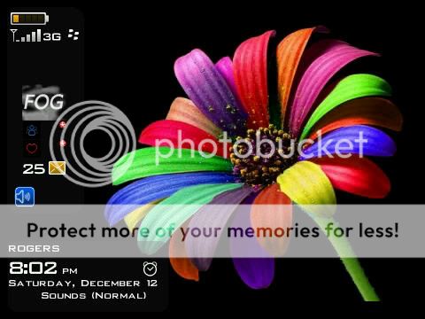
Ok. A great theme is now great again. Original font is back but now smaller and will fit buttons. Homescreen has been re arranged where the today icons now slide in from the top to allow a slightly larger banner so date wont get cut off.
Check out the new screenshots and download from HERE
Thank you so much for the hard work you put into this theme. However the font imo makes it almost impossible to use. I download from the updated link for version 2. could you possibly make the font user defined, or use a standart font?
is the first version still available with the standard font?
Thank you so much for the hard work you put into this theme. However the font imo makes it almost impossible to use. I download from the updated link for version 2. could you possibly make the font user defined, or use a standart font?
is the first version still available with the standard font?
I love this theme btw
THIS is the newest version. it has improved Banner placement and the original fonts i used in the first version, and reduced font size.
As far as changes to be made, ive already made many changes and desided to keep it as it currently is.


 .
.