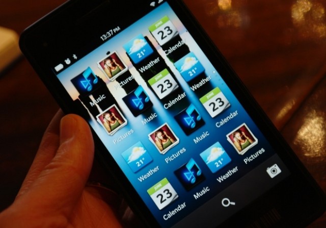
Should BB10 go back to these icons?
 http://cdn.crackberry.com/sites/crac...ome_edited.jpg
Drop the transparent box and give us these please. I like the smaller squared look. Its different than ios and android yet very clean and neat. The big square ones were just too big, the new ones just dont look right. I think they had it the first time.
Should BB10 go back to these icons?
I also like the icons in the pic above! If anything make the whole icon transparent. Doesn't make sense to have a full color icon with transparency around it..
Re: Should BB10 go back to these icons?
I agree with op, the original concept of icons much nicer and cleaner. Also agree with Kevin about how of a heavy feel the new icons have, just to big and over bearing really. Hopefully like the poster above mentioned, having themes available or icon sets would be nice option to have. Make everyone happy in the end.
Sent from my Galaxy Nexus using Tapatalk 2
Re: Should BB10 go back to these icons?
Too bad they can't please everyone :rolleyes: