1. Jtaylor1986's Avatar
    I don't know if I have just gotten used to them but compared to how bad they were when we first saw them I actually think they are nice now. They seemed to have changed the shadow in the background from grey to black which seems to have made a difference imo.

    BlackBerry 10 - Official News and Updates at BlackBerry.com - Global
    01-15-13 02:57 PM
  2. Admorris's Avatar
    I wish they would just do away with the stupid shadow, move the text up just a bit and that would make room for another entire row. Seems simple enough and would make the screen appear larger as well.

    Sent from my SGH-I317 using Tapatalk 2
    magutwit likes this.
    01-15-13 03:17 PM
  3. anon(1152406)'s Avatar
    I wish they would just do away with the stupid shadow, move the text up just a bit and that would make room for another entire row. Seems simple enough and would make the screen appear larger as well.

    Sent from my SGH-I317 using Tapatalk 2
    Completely agree - it makes the UI look "meh" and it is a VERY easy fix.
    01-15-13 04:07 PM
  4. just_luc's Avatar
    I don't know if I have just gotten used to them but compared to how bad they were when we first saw them I actually think they are nice now. They seemed to have changed the shadow in the background from grey to black which seems to have made a difference imo.

    BlackBerry 10 - Official News and Updates at BlackBerry.com - Global
    They've really grown on me too.. at first I didn't care for them, but the more I look at them it's just a very clean design. I definitely didn't like them when they where big and rectangular, I was calling for them to be changed to the playbook style.. but the current iteration I think it's the best of both. The icon itself (the portion that will be submitted by the developer) is that individual design, but the opaque box acts to standardize all of the icons to the same size and makes for clean lines in the grid. If you look at the playbook or your current blackberry, there's always a few icons that just have appearance of being bigger then more overbearing then the others.

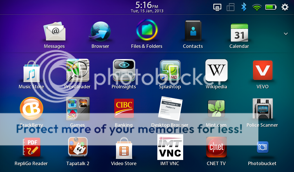
    checkout this screenshot i just took on my playbook.. how out of place does the IMT VNC icon look compared to it's too neighbors?


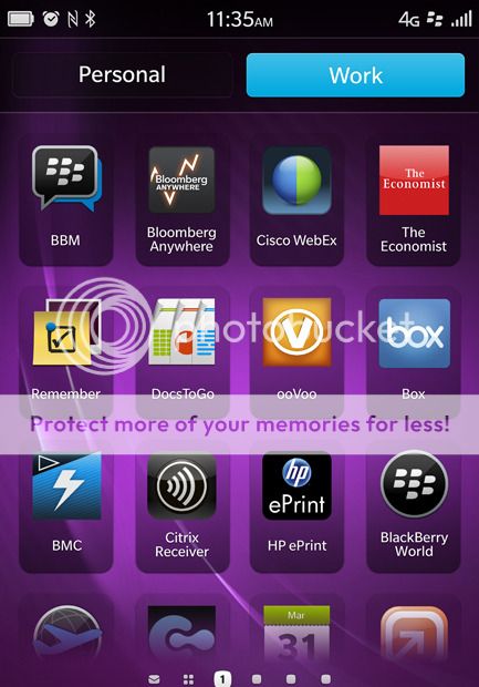
    Now take a look at the BB10 screenshot.. all the icons just line up perfectly even though some are square, some are round some like bbm are a individual shape, but they all work together because of the translucent box.
    .
    Revampd, Jonny-R, robkd and 6 others like this.
    01-15-13 04:12 PM
  5. RubberChicken76's Avatar
    The armchair UI designers are out, it seems ...
    01-15-13 04:31 PM
  6. magutwit's Avatar
    Somebody, tell them to take the Skype icon off. If is to do the same trick as with PlayBook...
    01-15-13 04:42 PM
  7. FlashFlare11's Avatar
    I didn't notice the color change in the shading until you mentioned it, and I completely agree. I actually didn't like the original square icons (the ones we saw at BB10 Jam Americas), but by the time RIM decided to change the style, they had grown on me (and I still think they look nice on the rendered images we saw a few days ago). I didn't like the gray shading, but the black looks nice and clean. I'm sure a lot of us are unsure because we haven't seen them yet in person. I assume they'll look much better when we actually hold the device in our hands.

    Besides, even if they didn't look as nice as they do now, BB10's home screen isn't the app grid; it's the Active Frame grid. RIM's developed an OS that's meant to keep us out of the app grid as much as possible, which is why I really don't think it matters what the icons look like. But I'm happy it's a style I'm fond of!
    01-15-13 04:46 PM
  8. RECOOL's Avatar
    Preferred the old icons looked great on the leak renders from rapidberry.These are cool the greybox is from O.S 5 icons although in OS 5 when you hovvered over the name light up then faded when icon change.I aint gonna spend much time looking at icons.
    01-15-13 05:30 PM
  9. Revampd's Avatar
    They've really grown on me too.. at first I didn't care for them, but the more I look at them it's just a very clean design. I definitely didn't like them when they where big and rectangular, I was calling for them to be changed to the playbook style.. but the current iteration I think it's the best of both. The icon itself (the portion that will be submitted by the developer) is that individual design, but the opaque box acts to standardize all of the icons to the same size and makes for clean lines in the grid. If you look at the playbook or your current blackberry, there's always a few icons that just have appearance of being bigger then more overbearing then the others.

    checkout this screenshot i just took on my playbook.. how out of place does the IMT VNC icon look compared to it's too neighbors?

    http://i1043.photobucket.com/albums/...G_00000029.png

    Absolutely agree. Individuality of icons but with a common theme.

    Now take a look at the BB10 screenshot.. all the icons just line up perfectly even though some are square, some are round some like bbm are a individual shape, but they all work together because of the translucent box.
    .
    http://i1043.photobucket.com/albums/...rk-english.jpg
    01-15-13 06:02 PM
  10. Jtaylor1986's Avatar
    It seems the beauty in bb10 is subtle as at first I didn't think the z10 was attractive when all we had was low quality spy pics of it. Now that it has been revealed in high res it is the subtle details that make it nice. It might be the same deal with the icons.
    01-15-13 06:18 PM
  11. ubizmo's Avatar
    The purpose of the icon "coasters" is clearly to make the icons and their labels clearly visible against any background. They appear to work.

    I have a wallpaper switcher on my Android phone, and certain icons get lost with certain wallpapers. This won't happen with the BB10 icons. It's a small detail, but it shows careful attention to the user experience.

    Ideally, the OS would allow the user to select the degree of transparency of the coasters.
    robkd and thekidshop like this.
    01-15-13 06:37 PM
  12. leafs123's Avatar
    I have to agree with just_luc in terms of the consistency in icon size. On the PlayBook, I am not a fan of the lack of consistency, uniformity of the icons. Side note: I would love for the calendar app to show the real time date on the icon, as opposed to "31".
    thekidshop likes this.
    01-15-13 06:49 PM
  13. howarmat's Avatar
    I have to agree with just_luc in terms of the consistency in icon size. On the PlayBook, I am not a fan of the lack of consistency, uniformity of the icons. Side note: I would love for the calendar app to show the real time date on the icon, as opposed to "31".
    i thought for sure it did in some screen shots.

    The icons do look the best they have so far but I am still not sold on backgrounds.
    01-15-13 06:53 PM
  14. gtpointer's Avatar
    I have to agree with just_luc in terms of the consistency in icon size. On the PlayBook, I am not a fan of the lack of consistency, uniformity of the icons. Side note: I would love for the calendar app to show the real time date on the icon, as opposed to "31".
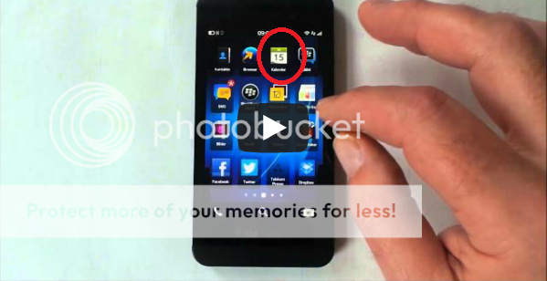
    In the latest Z10 video leak you can see they've implemented this.
    01-15-13 06:56 PM
  15. DaedalusIcarusHelios's Avatar
    They've really grown on me too.. at first I didn't care for them, but the more I look at them it's just a very clean design. I definitely didn't like them when they where big and rectangular, I was calling for them to be changed to the playbook style.. but the current iteration I think it's the best of both. The icon itself (the portion that will be submitted by the developer) is that individual design, but the opaque box acts to standardize all of the icons to the same size and makes for clean lines in the grid. If you look at the playbook or your current blackberry, there's always a few icons that just have appearance of being bigger then more overbearing then the others.

    checkout this screenshot i just took on my playbook.. how out of place does the IMT VNC icon look compared to it's too neighbors?

    http://i1043.photobucket.com/albums/...G_00000029.png


    Now take a look at the BB10 screenshot.. all the icons just line up perfectly even though some are square, some are round some like bbm are a individual shape, but they all work together because of the translucent box.
    .
    http://i1043.photobucket.com/albums/...rk-english.jpg
    That BB10 screenshot looks great actually. That wallpaper makes those boxes around the icons look slick. I think the only icon I'm still not satisfied with is the contacts icon (not in the screenshot above). It looked bad compared to the one in BB7 and the PB. I'm hoping it changes. But overall, the high-res screenshots look great.
    01-15-13 07:17 PM
  16. just_luc's Avatar
    I have to agree with just_luc in terms of the consistency in icon size. On the PlayBook, I am not a fan of the lack of consistency, uniformity of the icons. Side note: I would love for the calendar app to show the real time date on the icon, as opposed to "31".
    In the latest Z10 video leak you can see they've implemented this.
    +1

    I didn't notice that when I watched the video but you're absolutely right!


    Makes me think some of those "small details" that may not wow, but will really make the user experience the best it can be are still be refined right up to launch!
    01-15-13 07:31 PM
  17. leafs123's Avatar
    Nice to see they did that. It escaped me when I saw the video. All about the little details.
    01-15-13 08:39 PM
  18. EsJayDee's Avatar
    Am I the only one that hasn't recieved updates from this website after signing up?

    BlackBerry 10 - Official News and Updates at BlackBerry.com - Global
    01-17-13 06:01 PM
  19. Jtaylor1986's Avatar
    Am I the only one that hasn't recieved updates from this website after signing up?

    BlackBerry 10 - Official News and Updates at BlackBerry.com - Global
    Check your junk mail. They have sent 2 or 3 emails so far I think.
    EsJayDee likes this.
    01-17-13 06:02 PM
  20. EsJayDee's Avatar
    I checked, still nothing. but thank you.
    01-17-13 06:34 PM
  21. Jtaylor1986's Avatar
    I checked, still nothing. but thank you.
    The emails are basically just to tell you they updated the website that you linked to previously so I wouldn't worry about it.
    01-17-13 07:49 PM

Similar Threads

  1. Blackberry Playbook not looking good as of now
    By CrackberryBrandon in forum BlackBerry PlayBook
    Replies: 42
    Last Post: 01-05-11, 11:25 AM
  2. Uploaded new OS:: Email & SMS Icon are now missing!!
    By LessThan3myBB in forum BlackBerry Curve Series
    Replies: 9
    Last Post: 03-05-10, 04:18 AM
  3. Folder Icons are now changeable with .112 update
    By alex63 in forum BlackBerry Curve Series
    Replies: 5
    Last Post: 01-28-09, 06:07 PM
  4. Downloaded Iberry Blocks Theme now icons are missing!
    By michelleb in forum BlackBerry Themes
    Replies: 2
    Last Post: 09-24-08, 04:06 AM
  5. Downloaded Iberry Blocks Theme now icons are missing!
    By michelleb in forum BlackBerry 87xx Series
    Replies: 2
    Last Post: 09-24-08, 04:06 AM
LINK TO POST COPIED TO CLIPBOARD